🎥 Video of the KIT priority revisions prototype
KIT
A freelance UX design project for a startup digital business card app company
Adding a feature
Redesigning their core product — digital business card-sharing mobile app — for improved user experience.
I had the pleasure of working with startup company KIT on their UX writing project along with a small team. After wrapping up the UX writing project, I also became their sole UX design freelancer tasked with improving their UX as well as adding a feature and a redesign.
KIT, which is an acronym for ‘keep in touch’, created an app that allows people to easily share personal information using digital business cards via smartphone technology. With the app, users can quickly create various profiles to share, a.k.a “KITs” that can be transmitted to a contact’s phone that has the KIT app installed. The app also allows for KIT sharing via QR code or link to share with people who don't have the app.
About KIT
Design a new feature that embeds within the current KIT app on any device (web, desktop application, iOS, or Android) and ensure that it visually embeds well with the rest of the app.
Innovate existing Information Architecture and product offerings
Redesign the app to reduce user interface problems, increase task completion rate, and improve user engagement by at least 1.5%.
Create a fantastic user experience
Project Goals
Project Phases
Research | Define | Design | Test | Conclusion

Research Methods
Competitive analysis & Market research
Expert Interviews (App founder)
User interviews
Research Components
Research Goals
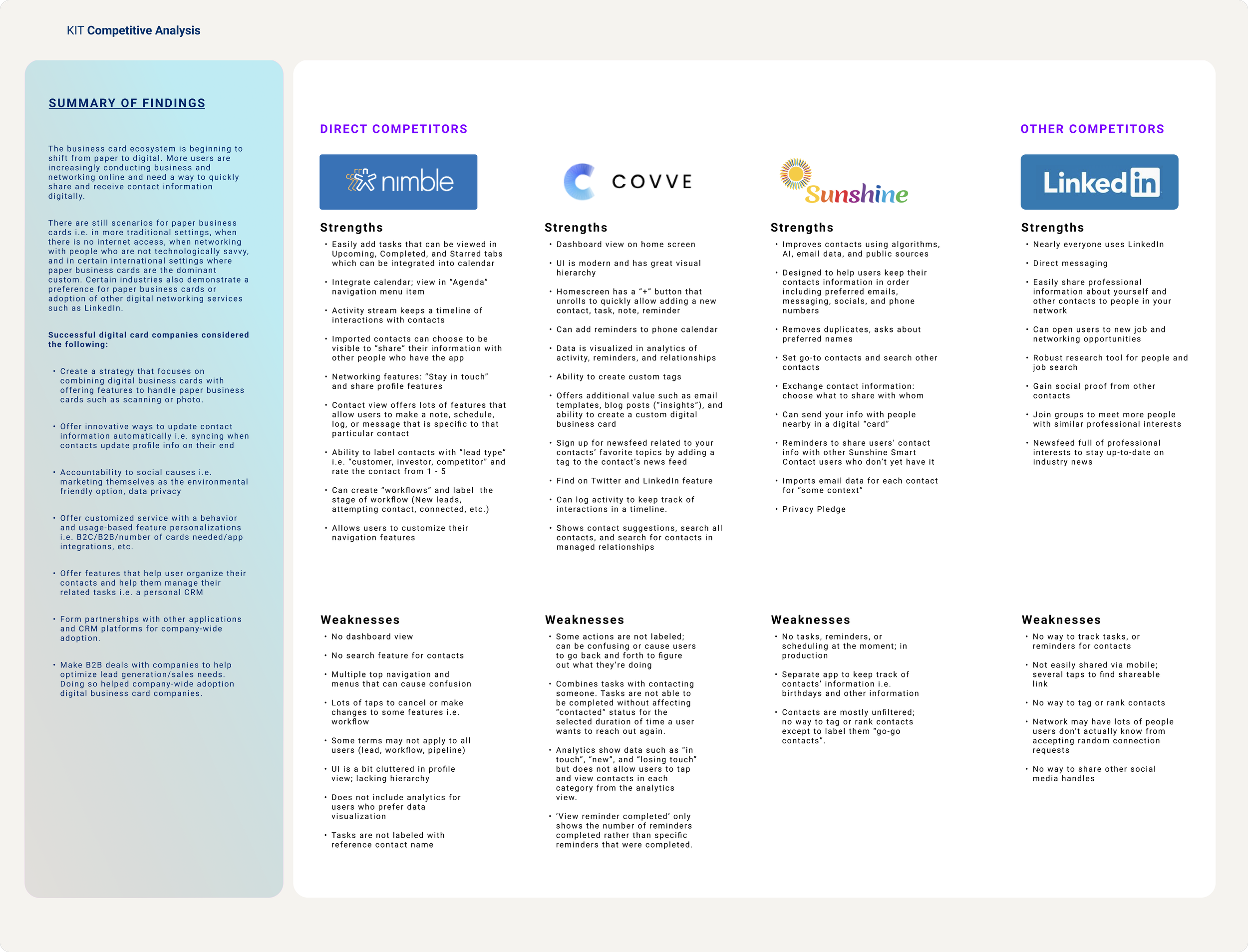
Competitive Analysis & Market research
Research Findings
Provisional Personas
While in the discovery phase of finding the best feature to add to an existing digital business card app, I wanted to learn:
What role does having or sharing a digital business card and contact organization play in people’s lives?
What frustrations do users have currently with making new contacts and keeping in touch with them?
What perceptions do users have about digital business card companies and contact management products?
What is the digital business card/lead-capturing journey like for the user? How do they make their decisions?
Why did users choose one digital business card/lead-capturing company over another? What do they like or dislike about their current choice compared to competitors?
Competitive Analysis & Market Research
Conducting a competitive analysis allowed me to see both standard and competitive features in the current personal CRM app market. I compared direct competitors as well as indirect competitors to get a sense for what users have come to expect in networking features:
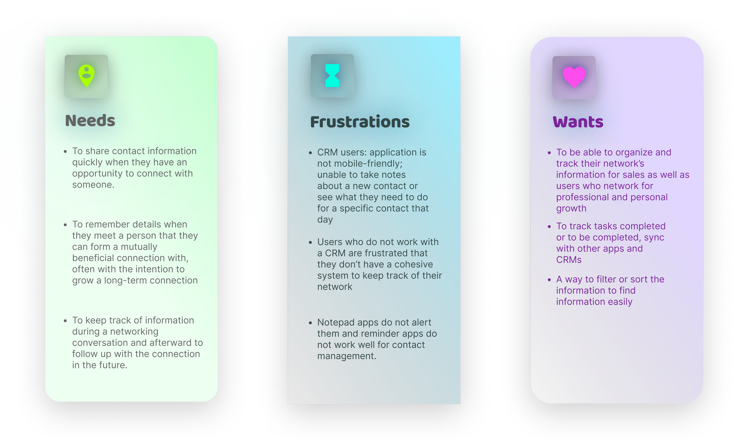
The next step was to conduct 1-on-1 user interviews to gather qualitative data about user experiences with Contact management and networking apps. I learned about users’ top three needs, frustrations, and wants:
Research Findings
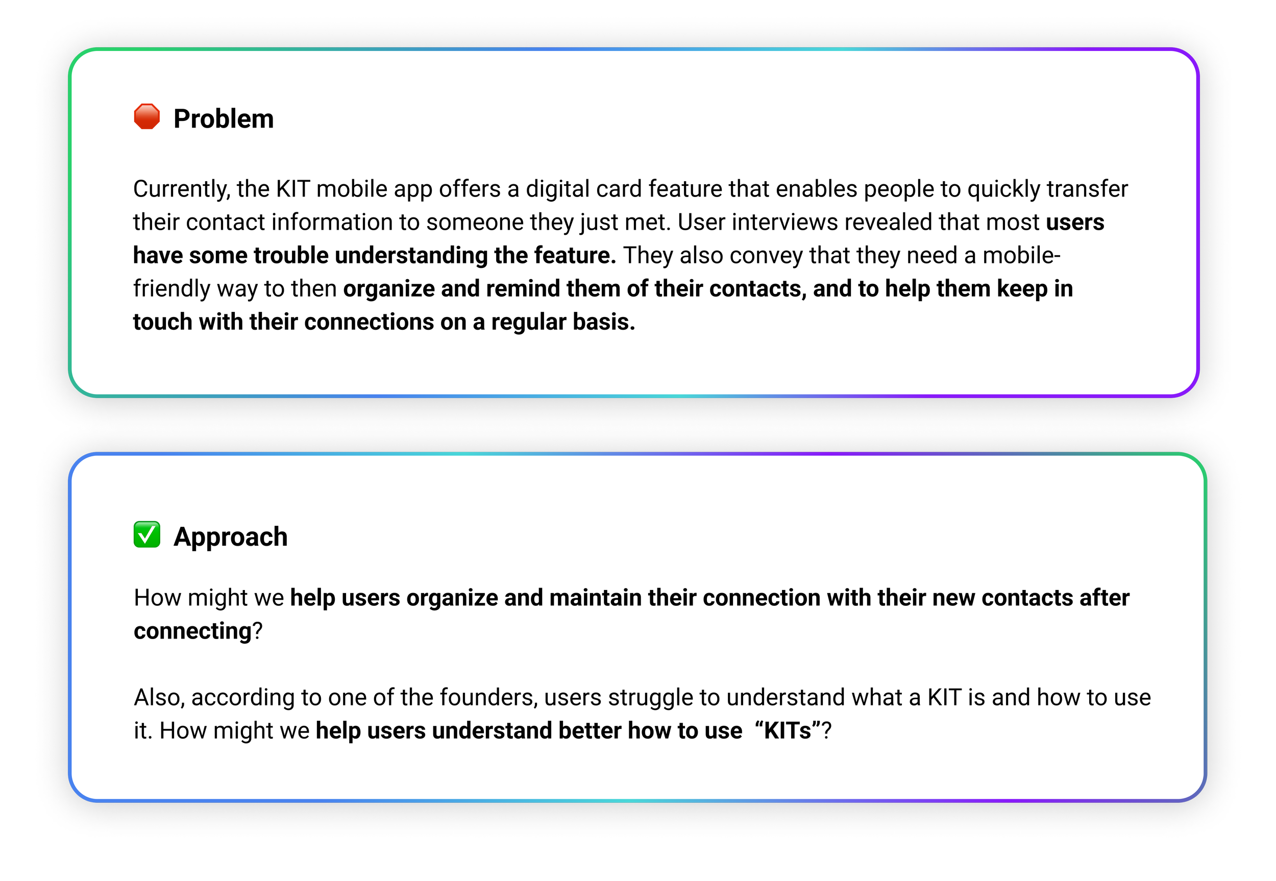
⚡️Challenge

🎯 Based on user feedback on the existing app and similar apps, networking and organizing contacts were the biggest points of frustration. I decided to focus on creating a to-do/task management feature to help users organize notes, tasks, and timelines for each of their contacts that allows for customized notifications.
Define Components
User Persona
App Map
User flow
Wireframes
User Persona
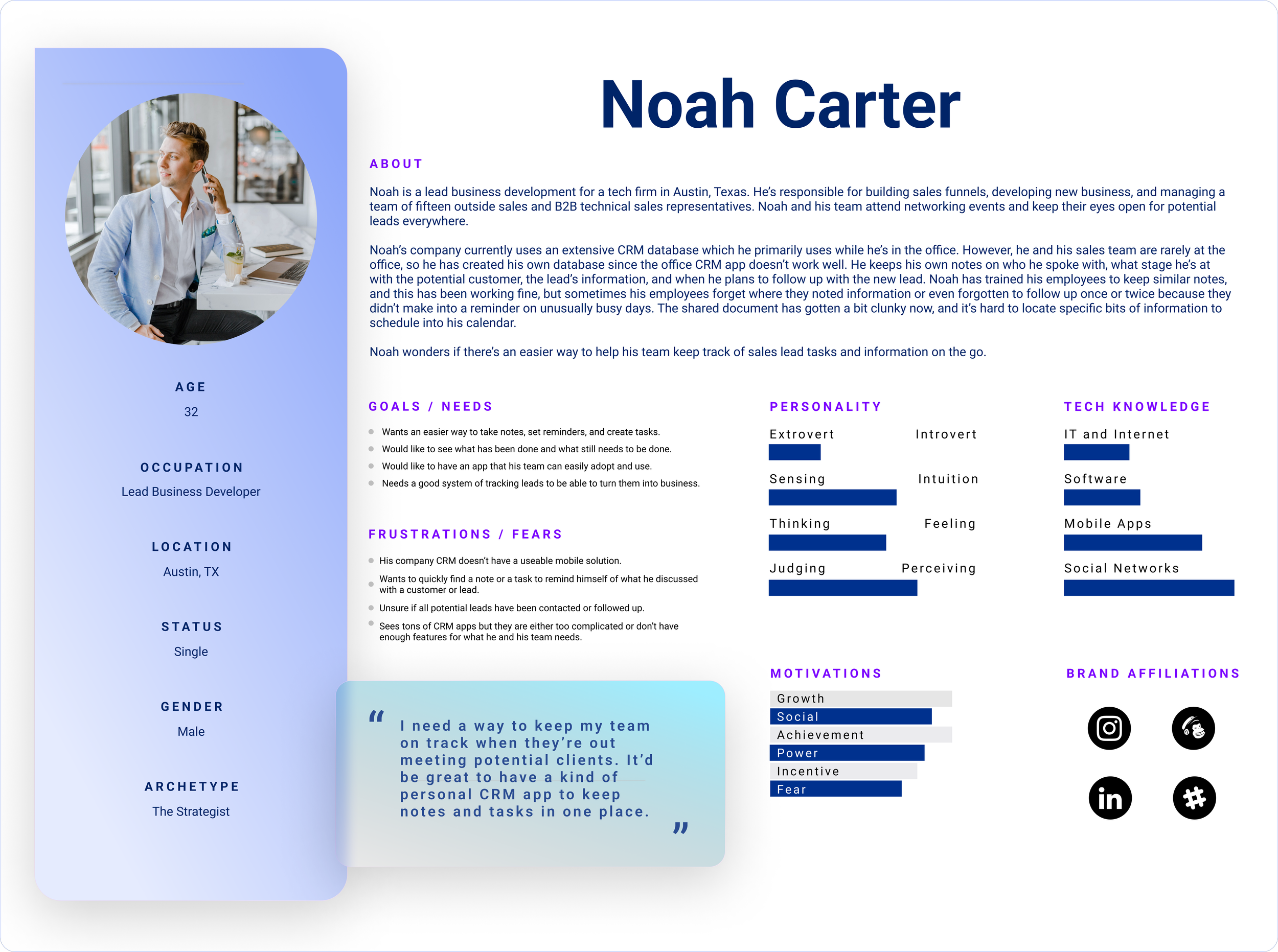
I decided to create a persona that combined all of the user participants’ needs, frustrations, and desires.
The majority of people who need to organize and maintain a contact database work in sales, business development, or similar roles.
They need a simple solution to keep track of contact information and be reminded of follow-up calls, of when they last spoke, as well as specific details about the client or potential client.
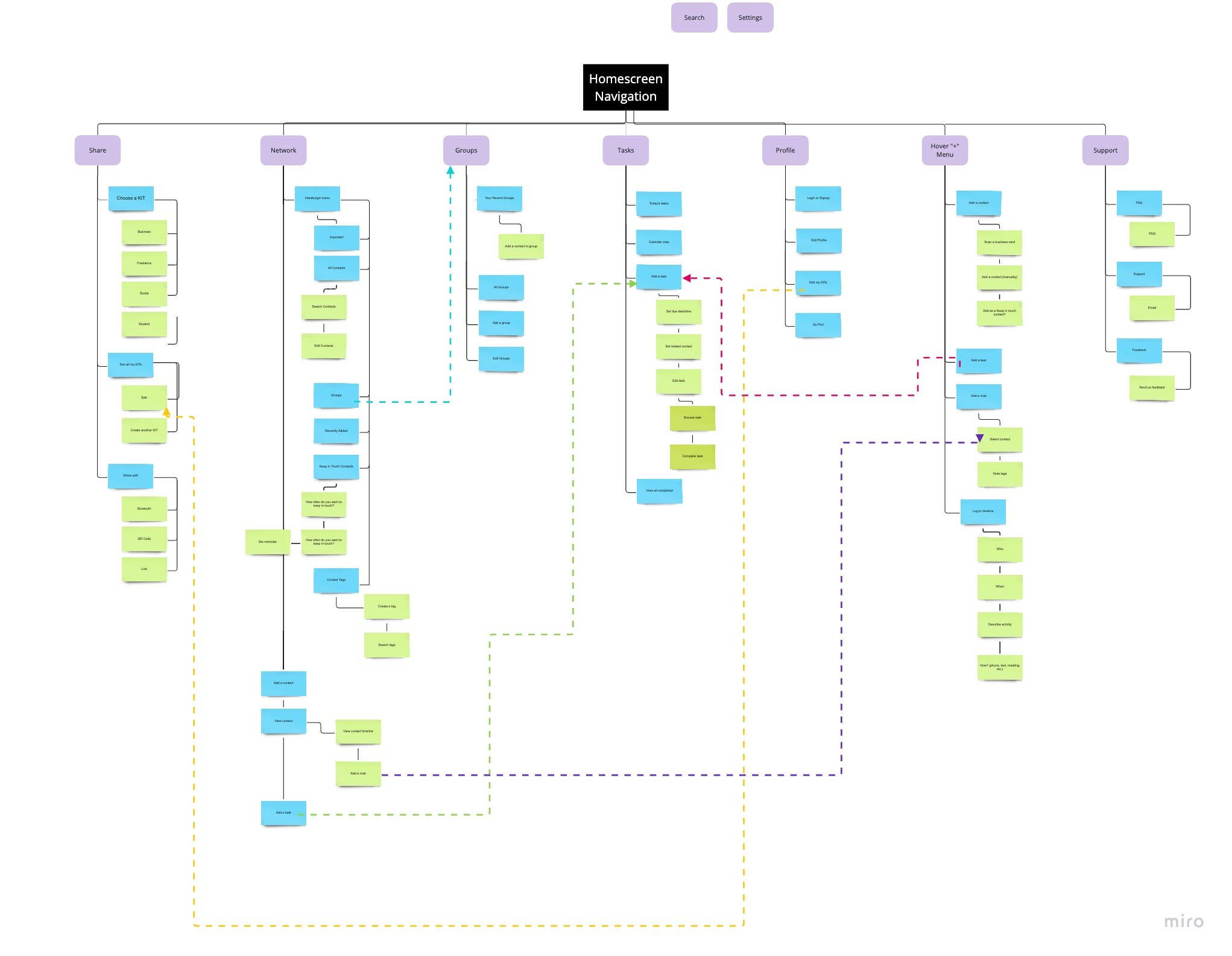
App Map
Based on card sorting results, the site map of KIT’s entire Information Architecture was designed to be as straightforward as possible to help users find features easily. Some sub-categories are also placed in additional main categories for ease of access e.g. Create a contact.
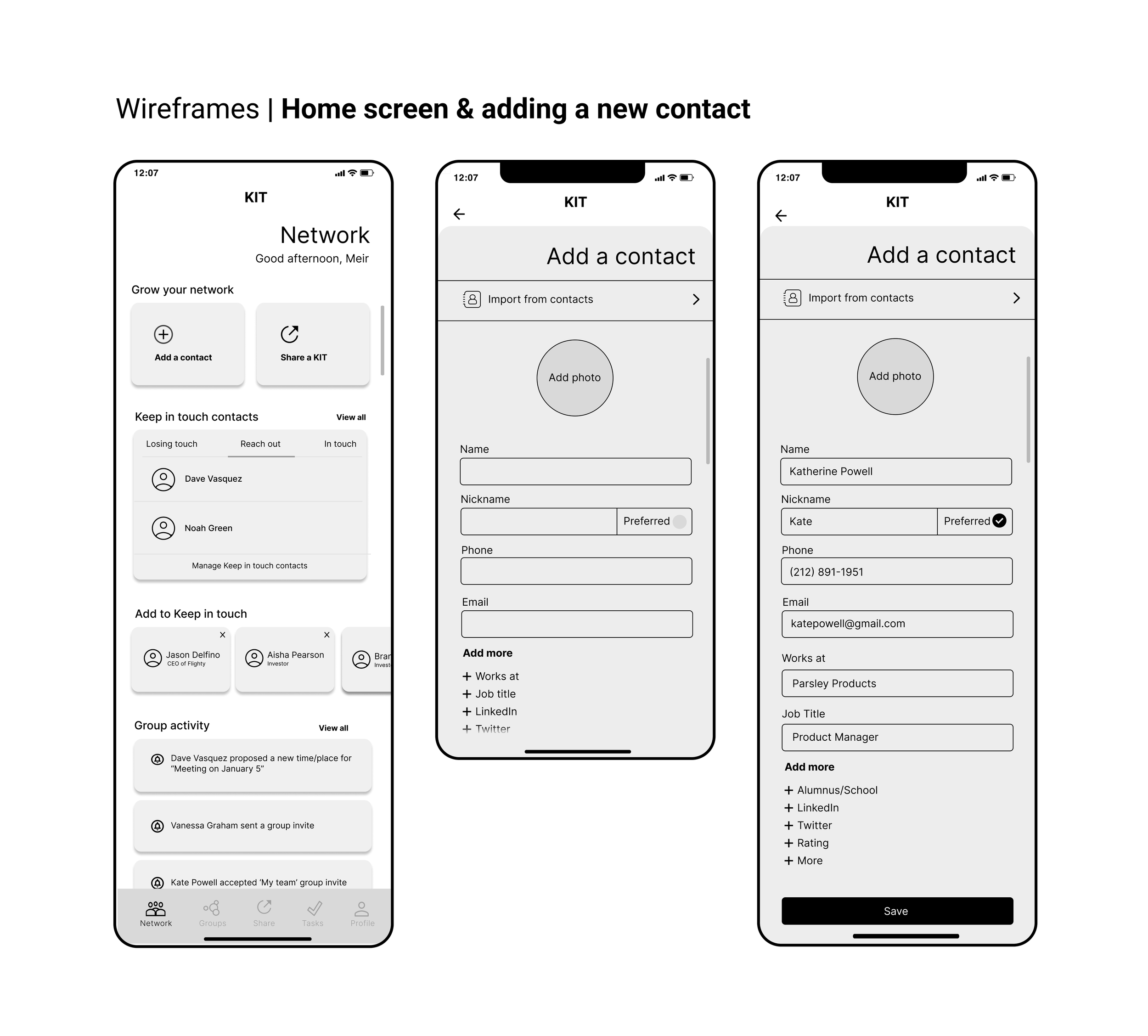
Wireframes & Low-fidelity Prototype
I created wireframes and a lo-fi prototype from several initial sketches. I discussed design decisions with one of the app founders and conducted a quick lo-fi prototype test with 4 participants which showed me where to make changes in the Design phase.
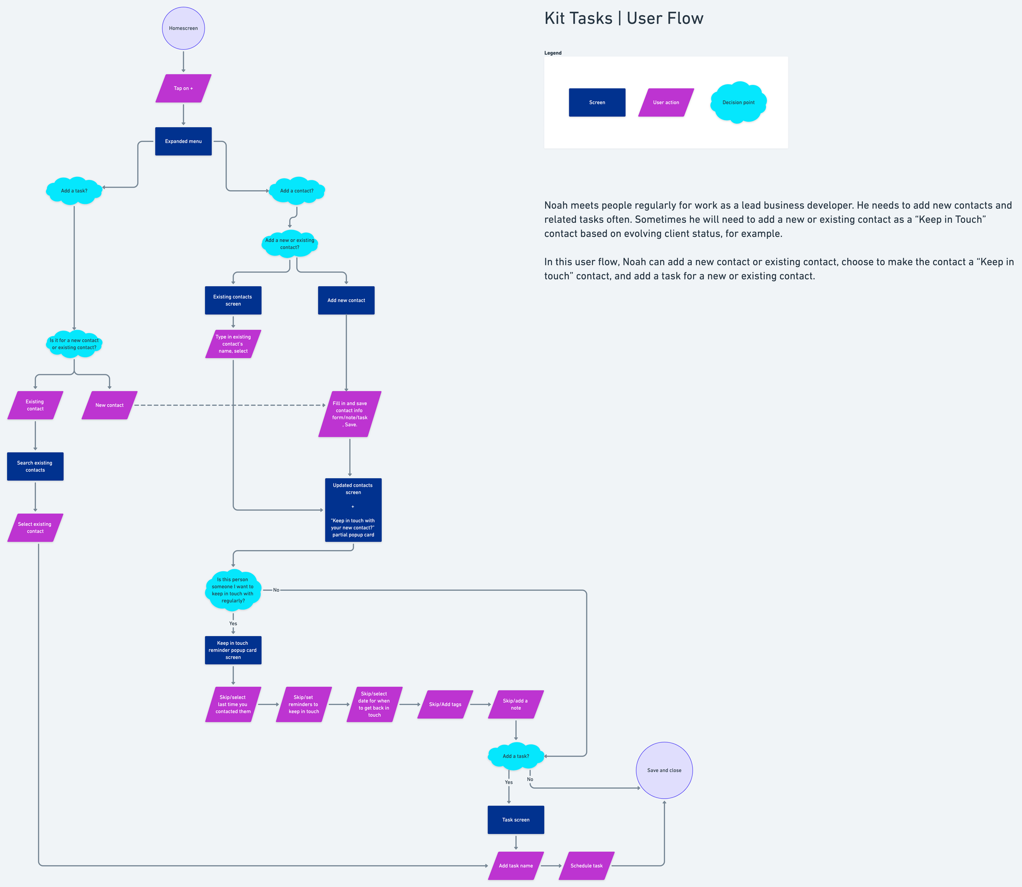
Task Flow
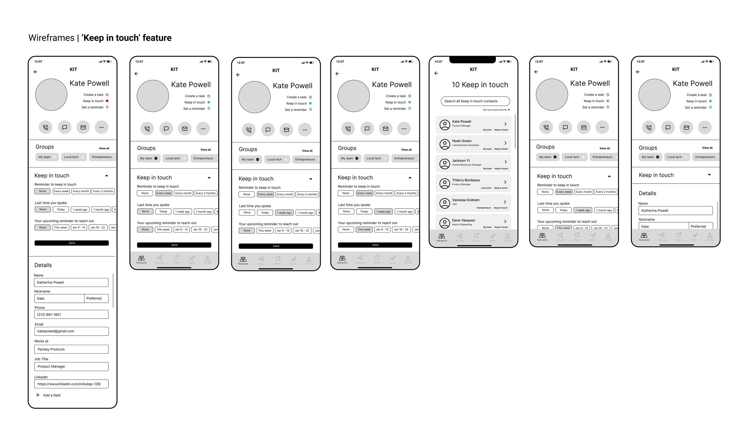
I created a KIT sharing and contact information organizing flow after a user captures a new contact’s information. I presumed from user interview feedback that most users will want to set up specific ‘keep in touch’ preferences for each new contact.
Card Sort
I used Optimal Workshop and recruited seven user participants. The results displayed lots of variability in user expectations in terms of the labels and categories they expected certain features to belong, which tells me to make features as easy to find as possible in several places in the app. The feature “tasks” had the highest consensus regarding what users expect to see in this tab, which shows me that I will need to ensure expected features related to tasks are found in the “Tasks” tab.

🎯 Since the app founders were interested in a dark-mode visual design, I decided to create a memorable and modern but widely accessible dark-mode UI. The founder I discussed some of the gestures and design features such as drop-down and accordian menus.
Design Components
High-fidelity Designs
Clickable Prototype
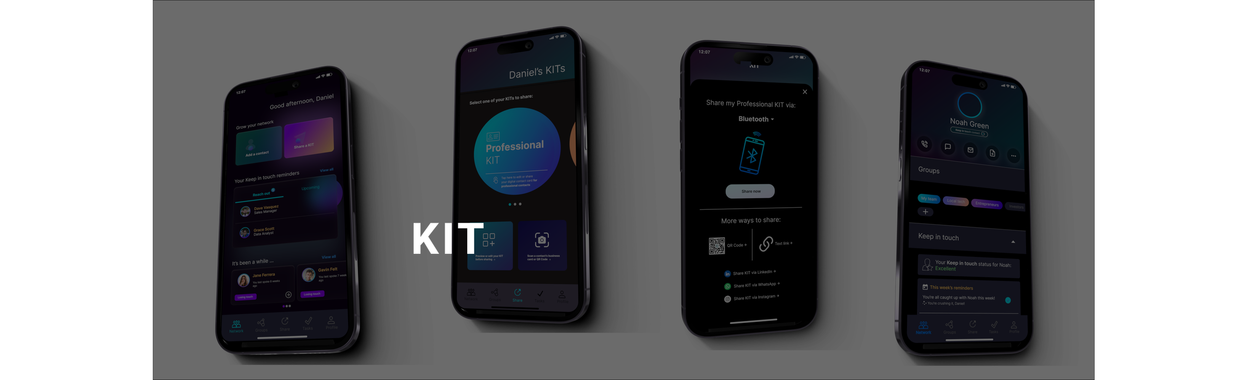
Hi-fi Designs & Prototype

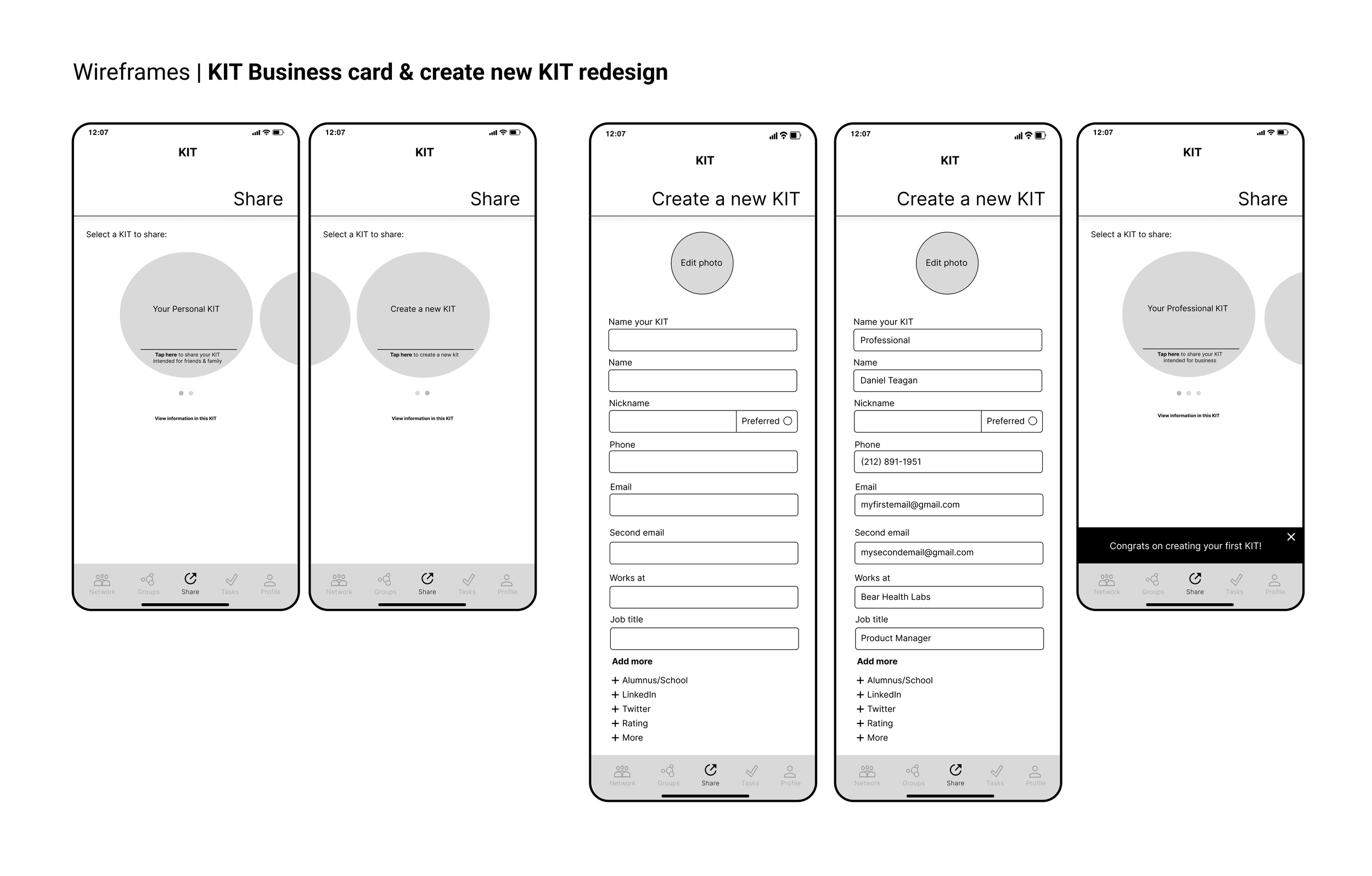
🎯 To test the high-fidelity designs, I created a clickable prototype in Figma and tested five participants on five tasks.
Design Components
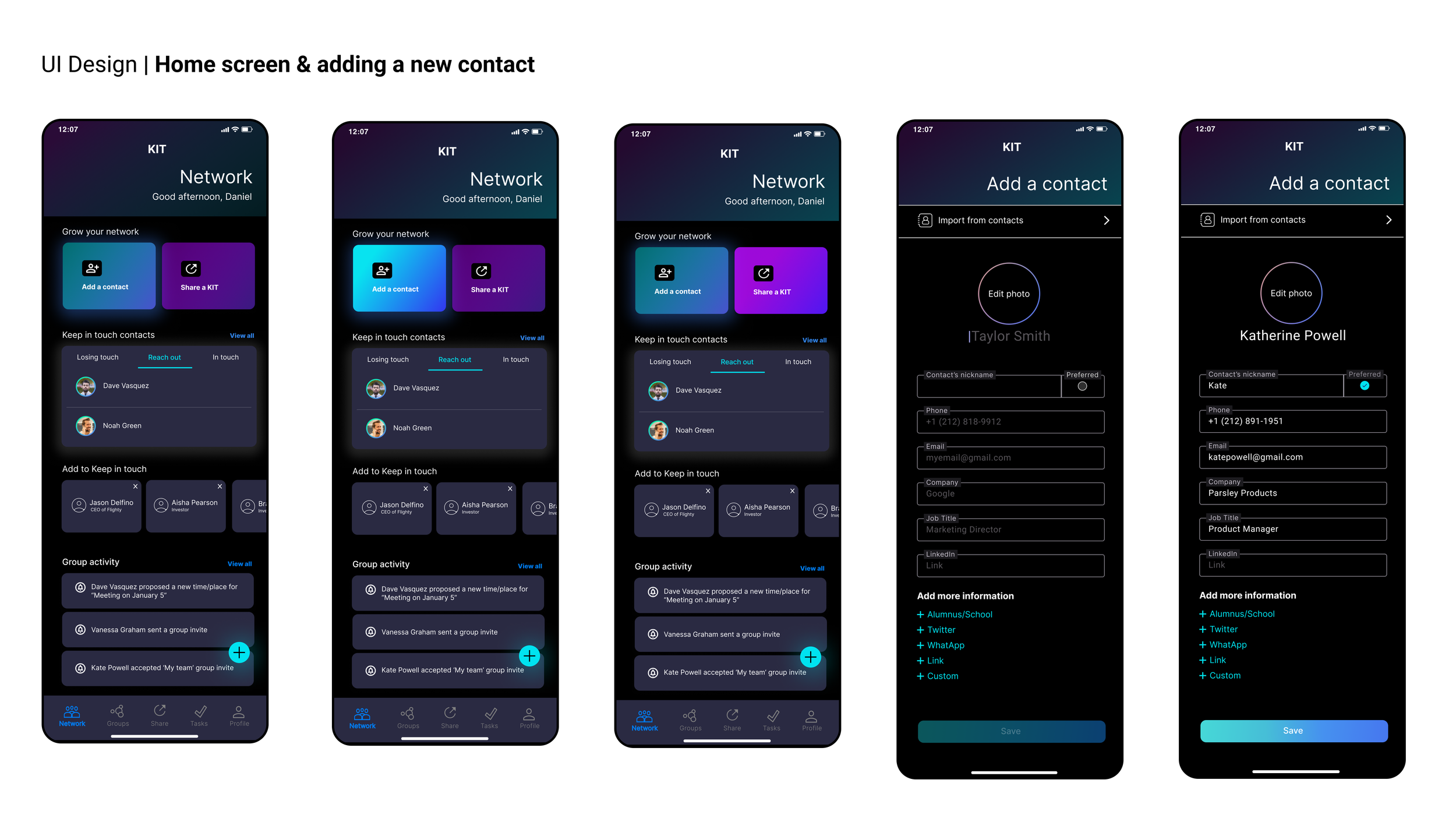
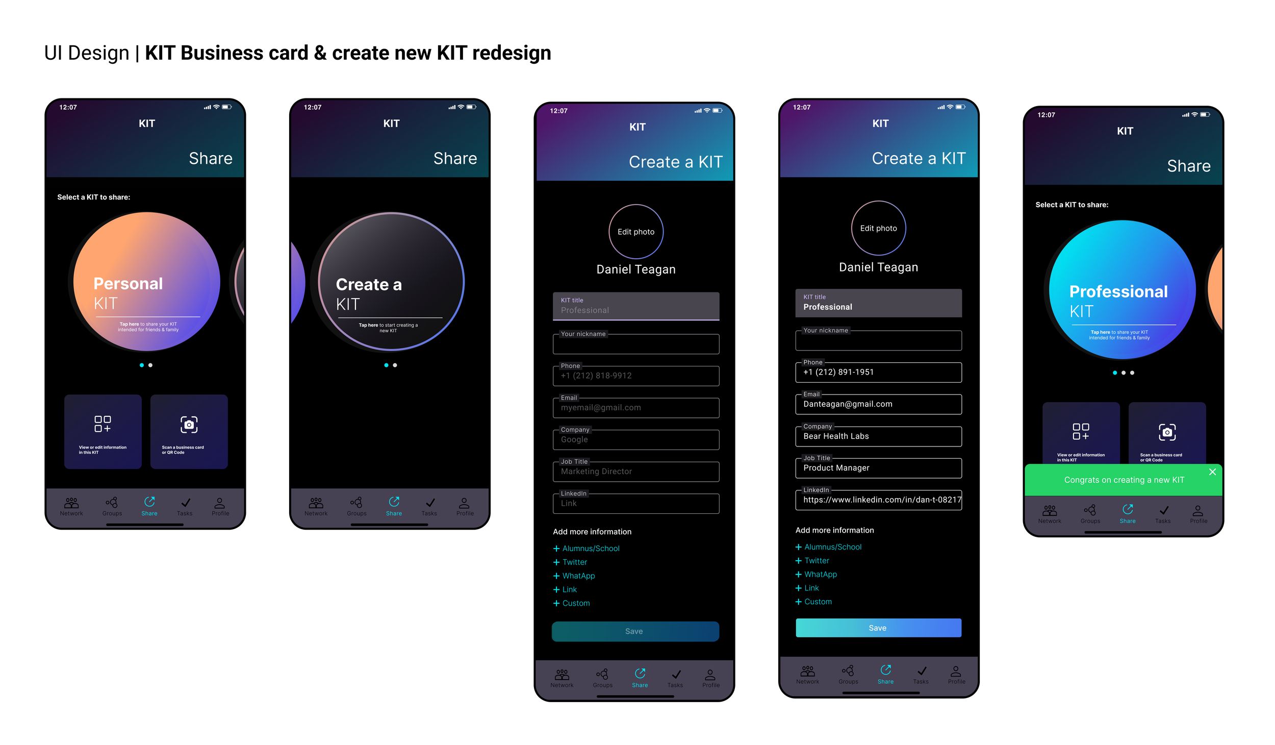
Task 1: User exploration of the KIT home screen and create a new ‘Kit’.
TASK SCENARIO:
“Take a moment to look at the UI and share anything that stands out to you. Then, I'd like for you to create your first KIT and name it Professional Kit.”
TASK NOTES:
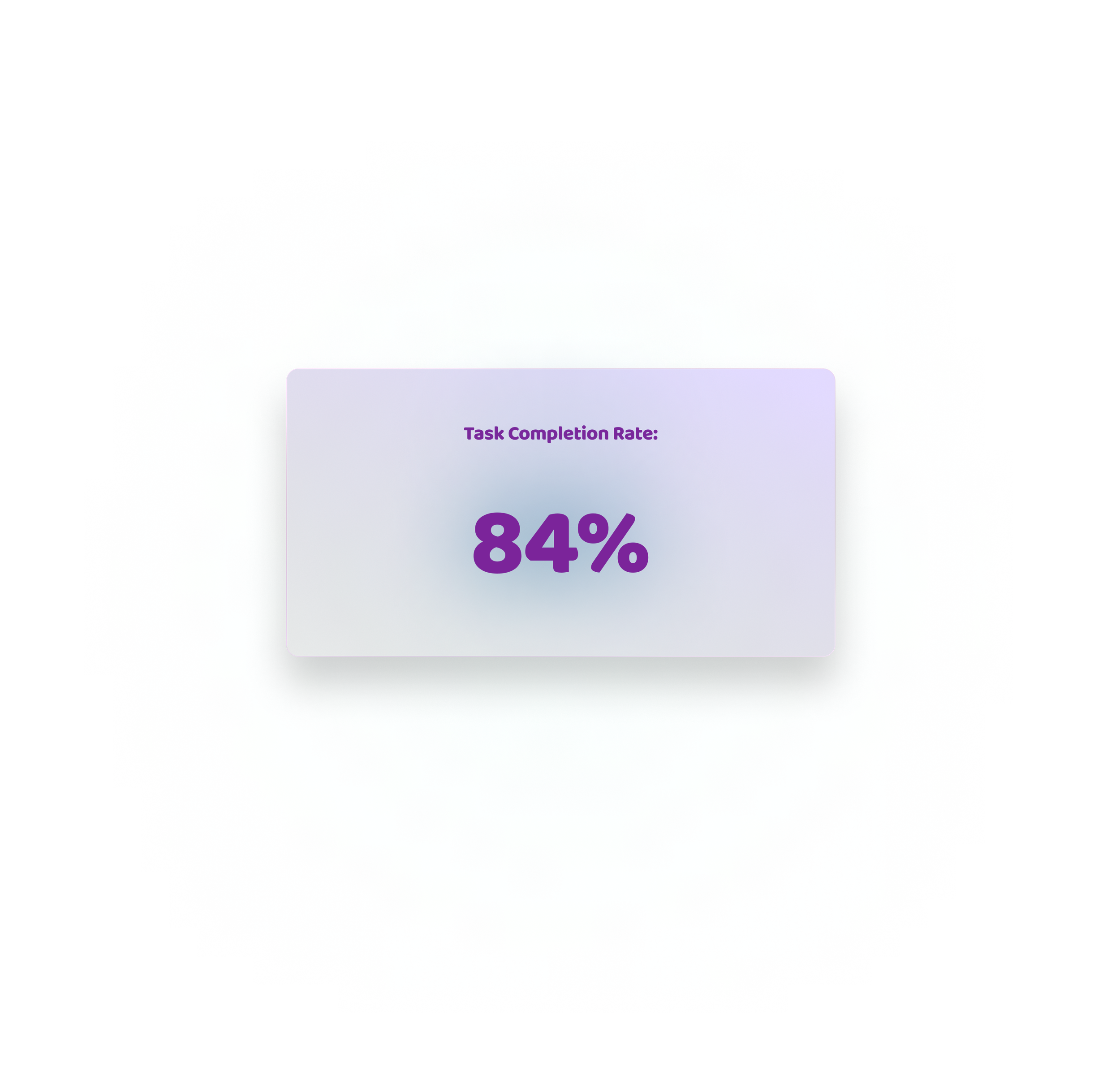
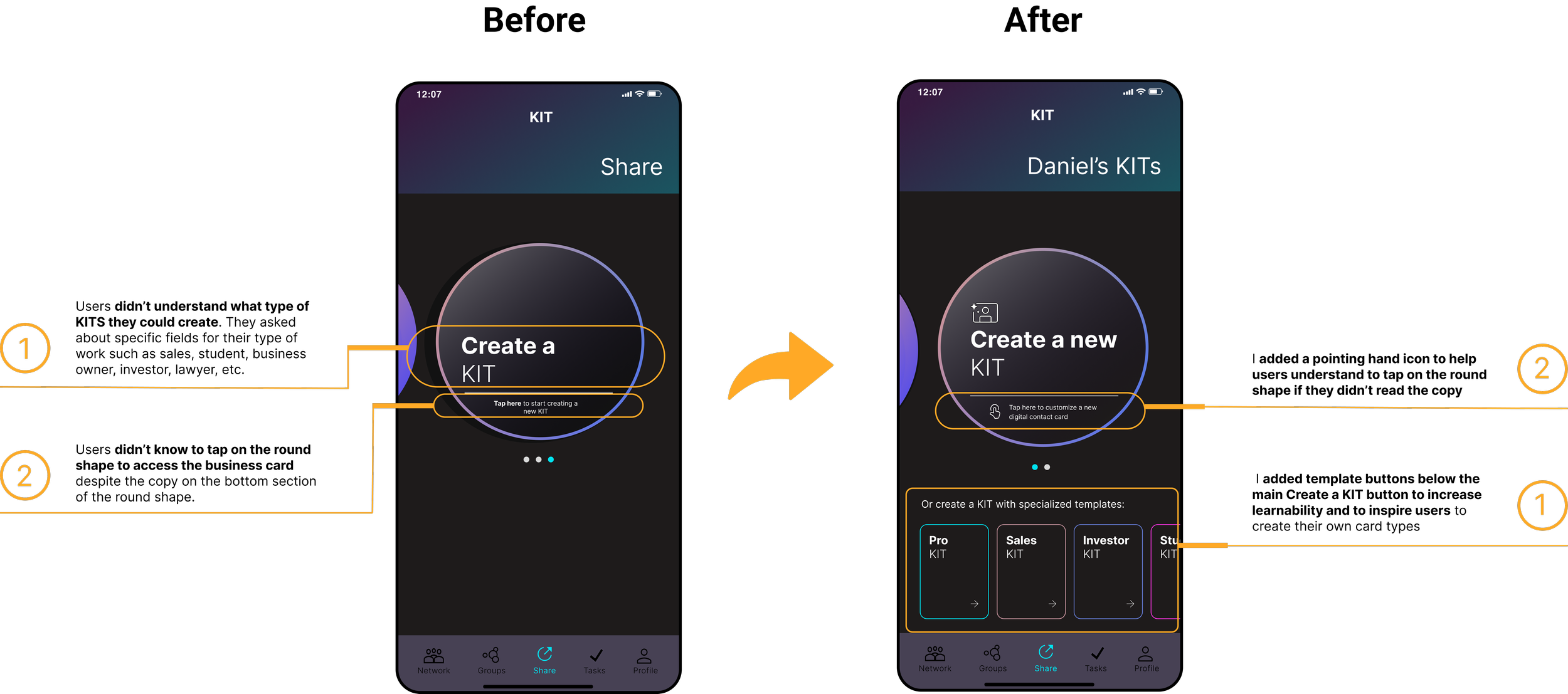
Participants liked the UI and home screen layout with the most important tasks made more visually prominent. All participants liked the ‘Keep in touch’ feature and thought that it would be helpful to maintain relationships. All participants were intrigued by the digital business card concept via ‘KITs’ and thought that creating a new Kit was simple. Some participants were initially confused that the round shape signified their digital business card which told me to add more supportive design elements and/or copy. Task completion rate total increase: 108%

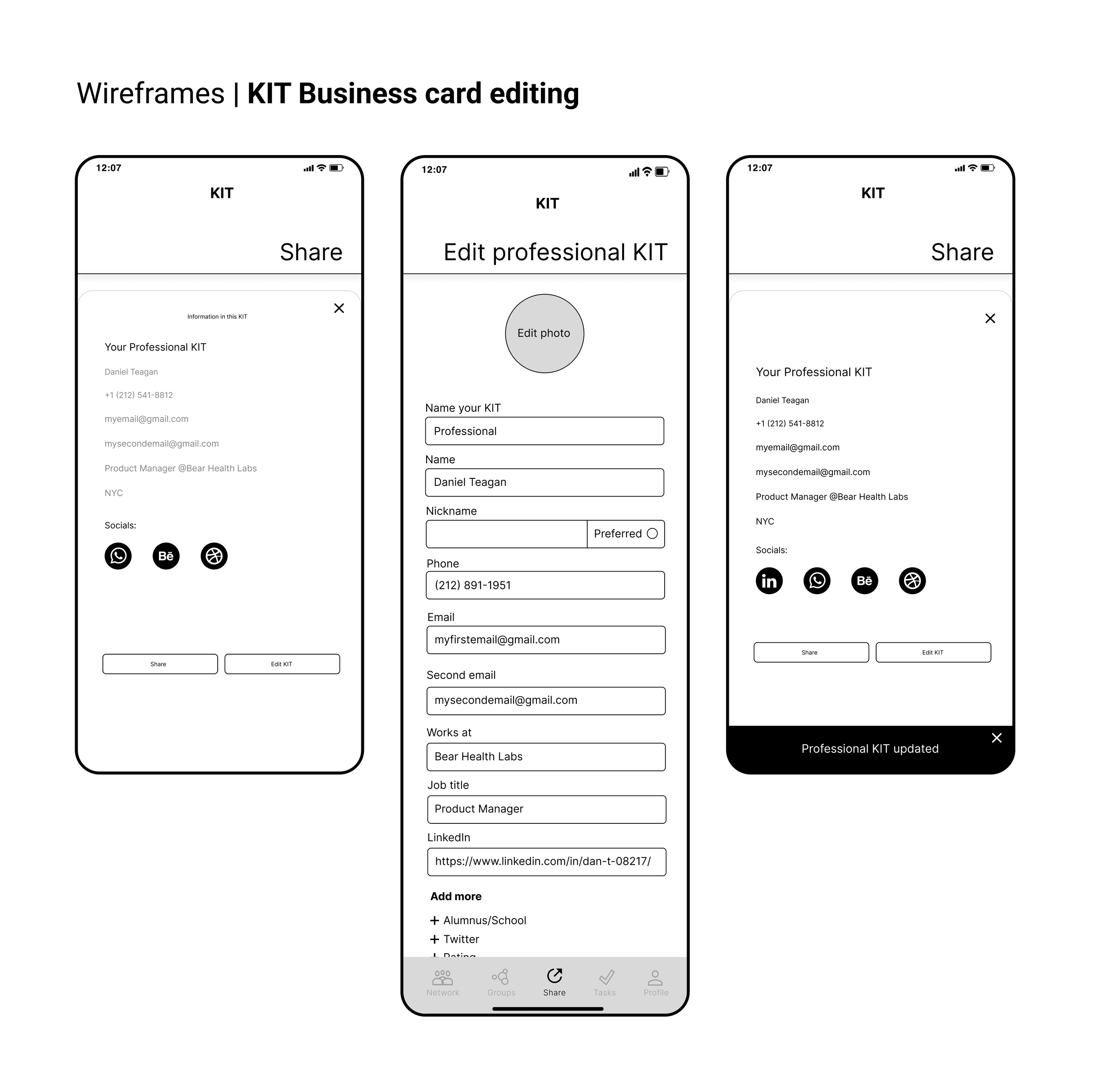
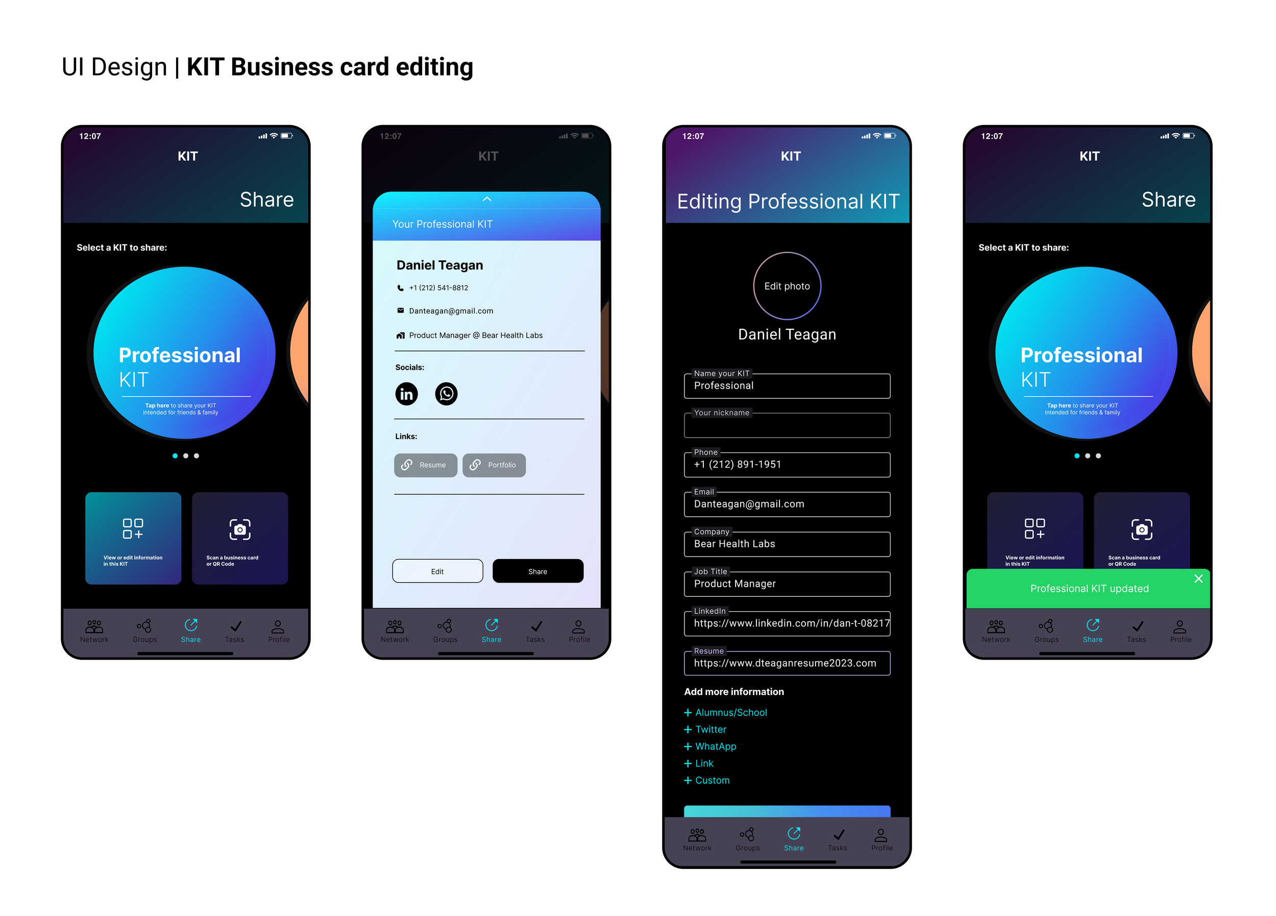
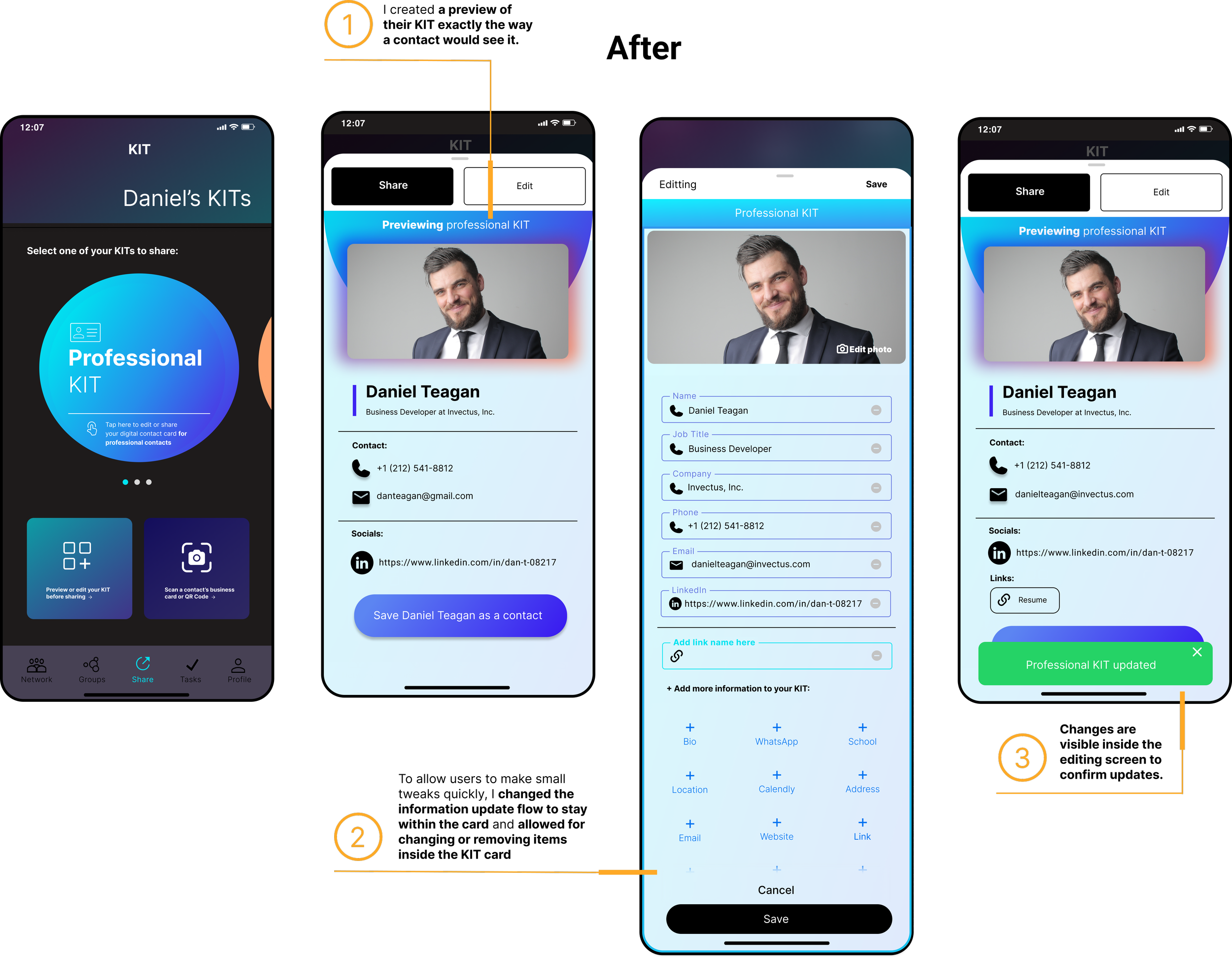
Task 2: Editing ‘Kits’.
TASK SCENARIO:
“You want to preview the Kit you just made and see that you forgot to include your resume link. How would you go about adding the link to your existing kit?”
TASK NOTES:
Participants appreciated that they could easily edit the KIT information and create as many types of KITs as they wanted. They particularly liked that they could add a custom link.
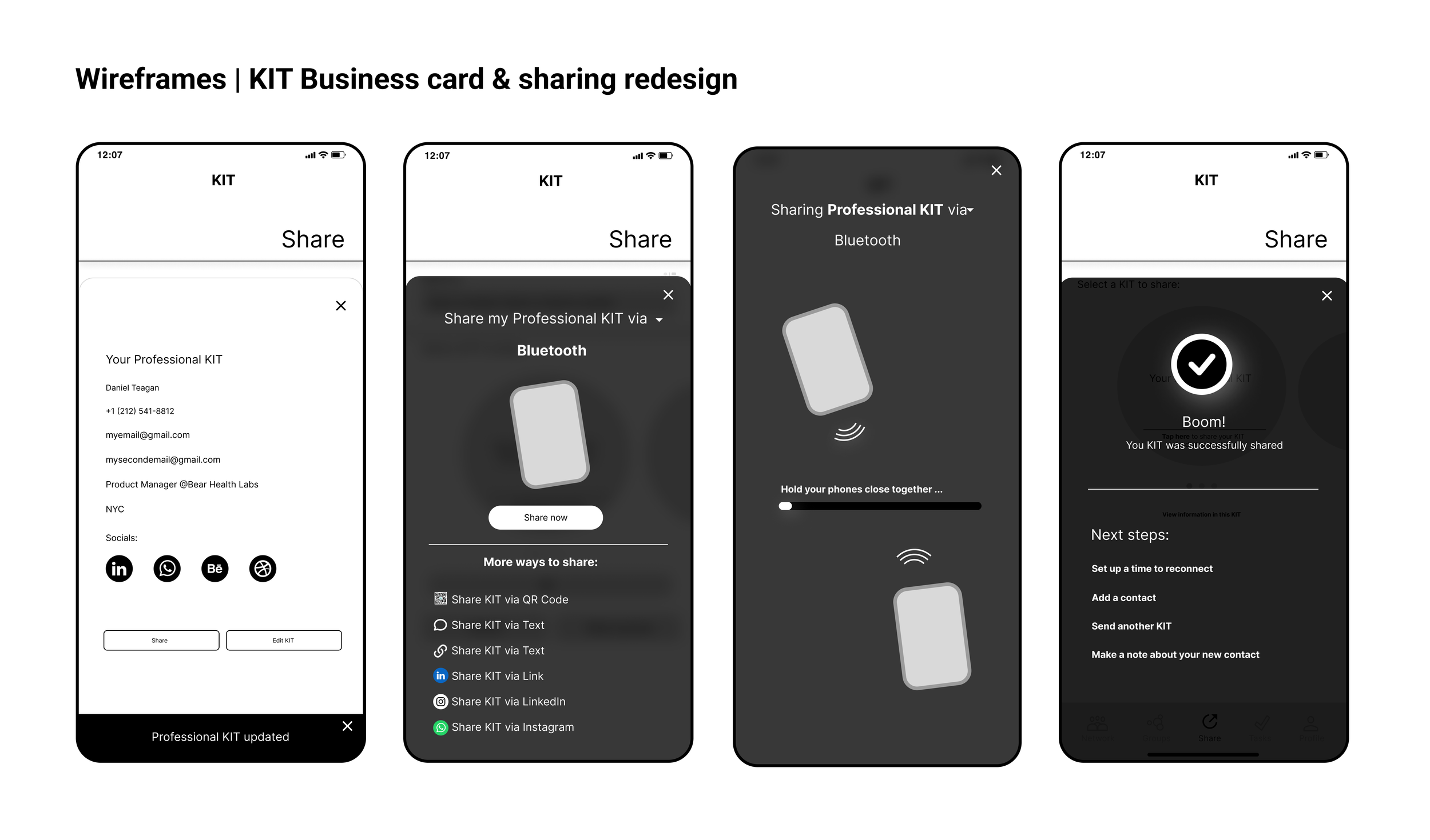
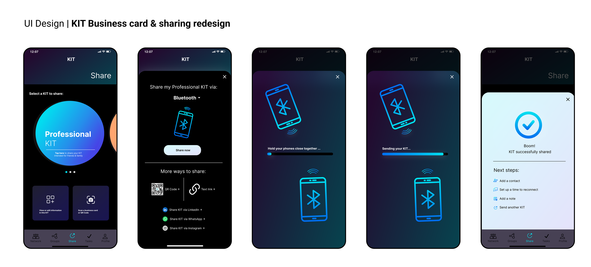
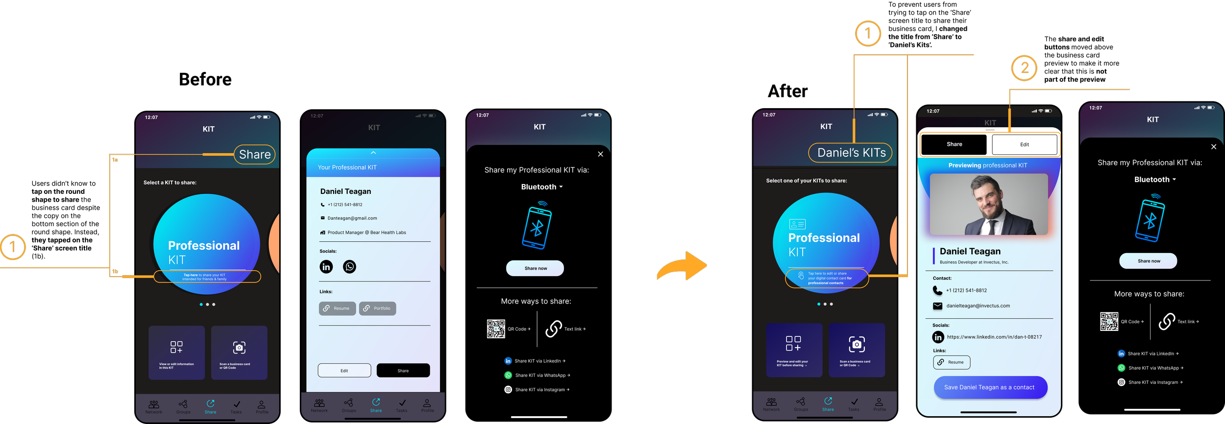
Task 3: Sharing a ‘Kit’
TASK SCENARIO:
“Now I'd like for you to imagine that you're at a conference and you want to share your KIT. How would you do that using Bluetooth?”
TASK NOTES:
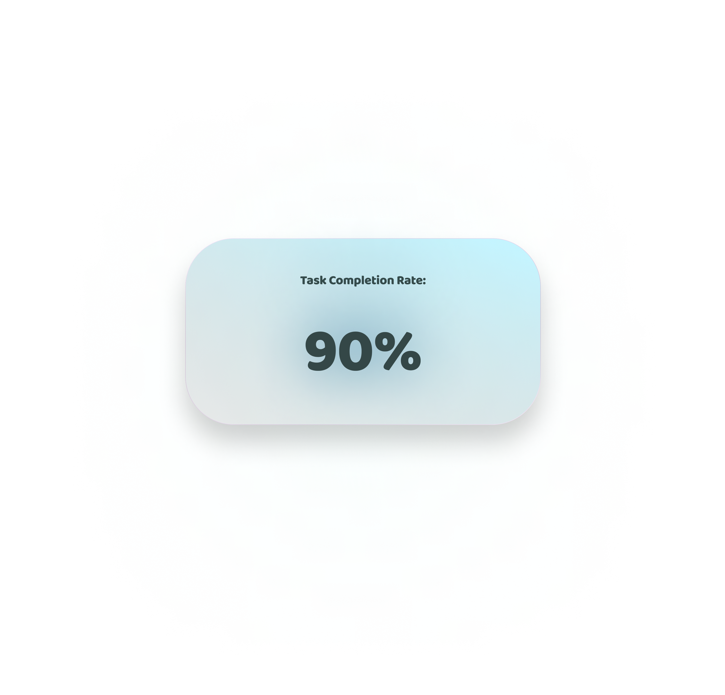
Participants liked the way that the policy information was displayed, but several seemed confused about how to access their KIT to share; many participants wanted to tap on the screen title ‘Share’. Once they accessed the share screen, most users thought that sharing with Bluetooth, QR, etc. was straightforward. Task completion rate total increase: 71%
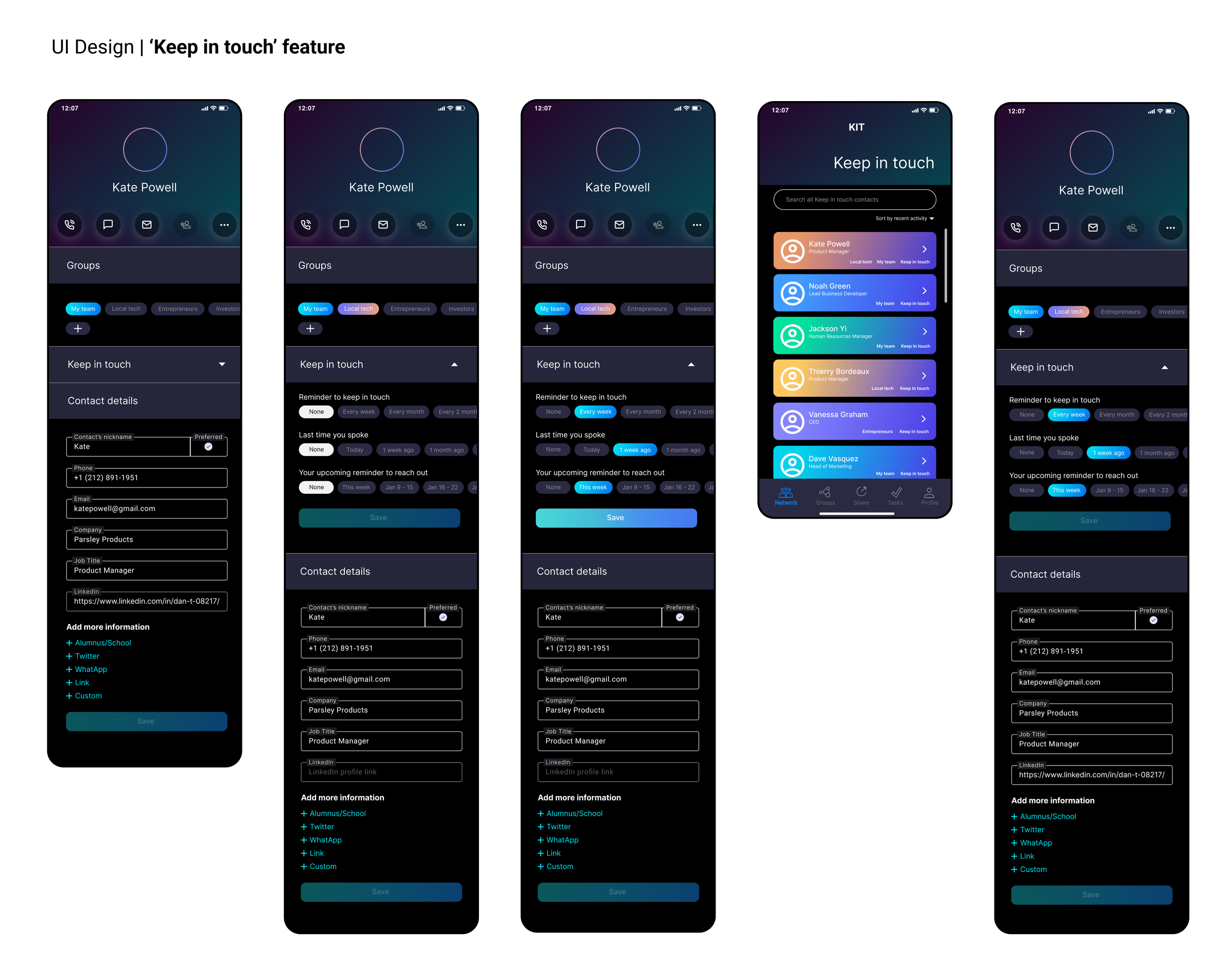
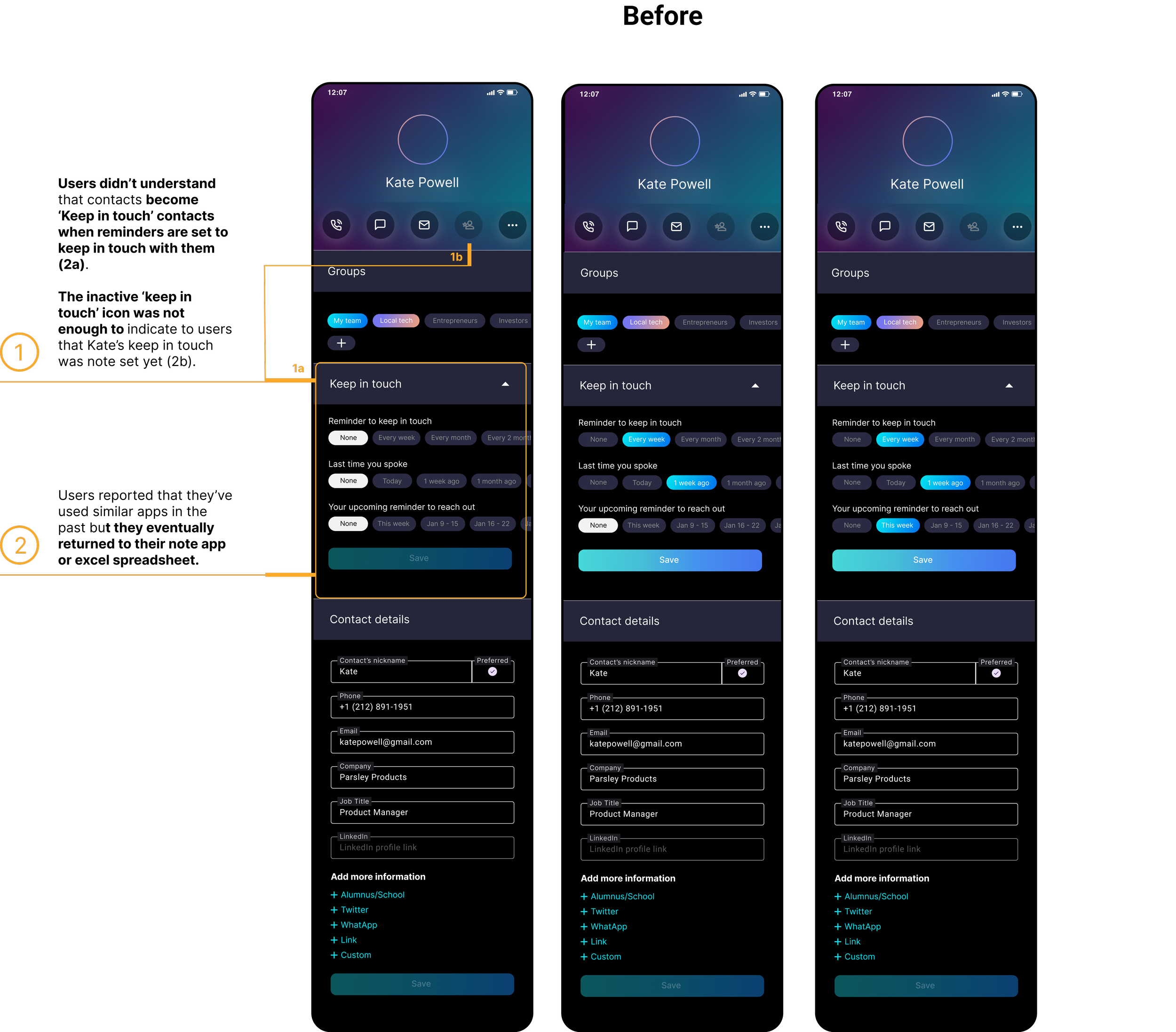
Task 4: Setting a new contact as a ‘Keep in touch’ contact
TASK SCENARIO:
“Let's say you met someone you want to keep in contact with. Add your new contact, Kate. Now, you’ve decided to also make her a "keep in touch" contact. You want to note that she is part of the Local tech group, and you want to be reminded to keep in touch with her weekly. You also want to note that you spoke with her a week ago and you want to reach back out again later this week.
TASK NOTES:
Participants liked the way that the menu could be hidden when not in use, and that there were several settings to help them keep in touch with contacts; the reminders and adding contacts to groups were particularly useful. Some participants still didn’t understand that by adding the reminders to Kate’s contact profile, they were in fact changing her status from a ‘regular contact’ to a ‘Keep in touch’ contact. This clearly showed me that participants were still confused about the difference and some additional clarification was needed.
Task 5: Editing a contact
TASK SCENARIO:
“Now you want to go back to Kate’s profile to add their LinkedIn link. How would you go about doing that?”
TASK NOTES:
Participants liked the way the contacts screen listed all of the ‘Keep in touch’ contacts and how easily they could access all their ‘Keep in touch’ clients. Some users still didn’t understand that the list was their ‘Keep in touch’ contacts rather than their full list of contacts which helped me understand that I should adjust the design to make this clearer. Task completion rate total increase: 55%
🎥 Video of usability testing prototype
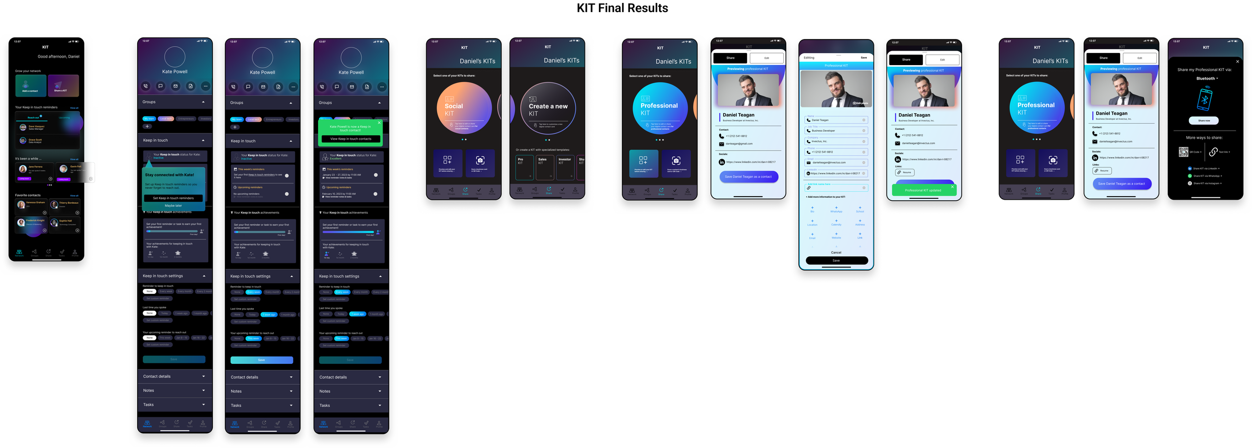
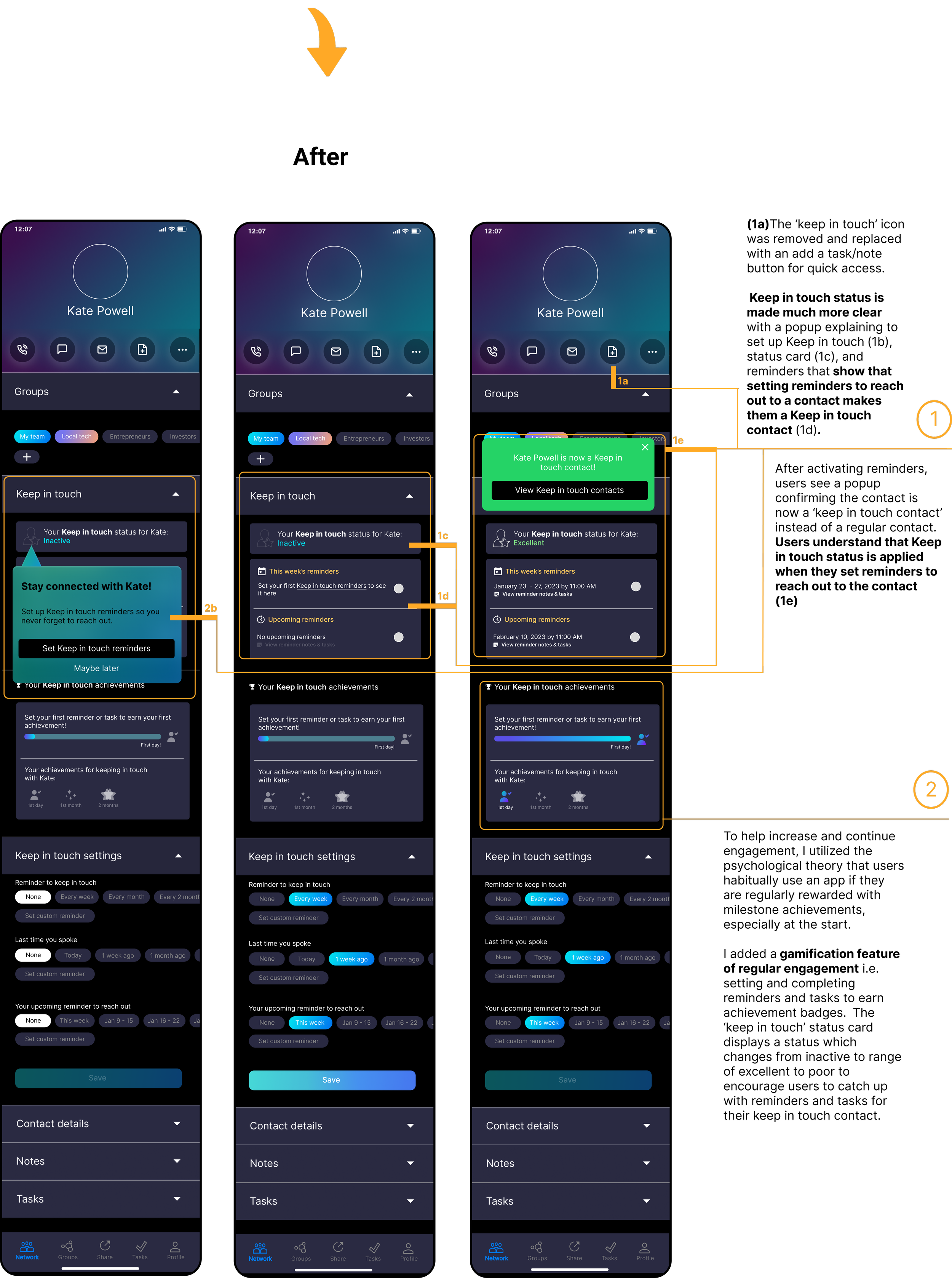
🎯 After conducting usability tests, completing an Affinity Map, charting the most valuable changes in a Value vs. Effort Matrix, and conferring with one of the co-founders, I made some revisions to the high-fidelity designs:


Conclusion Components
Priority Iterations
What I learned
What I would do differently
Priority Revisions


What I Learned

Users tend to have a harder time understanding the concept of an app if it is using an unfamiliar idea; in this case, a “Kit” as a digital business card and “Keep in touch” contacts for example. Design should help to lead users to learn an app quickly and clearly. In particular, a walk-through tutorial would have been useful to quickly teach users about the concept of the app, KITs, and ‘Keep in touch’ contacts.
Working with one of the founders of this app was an interesting, real-world look at ways to go about juggling both business and user needs as well as managing a tight turnaround time and deadlines.
Most users reported that they have used similar apps in the past but eventually stopped using them. To combat this, I included gamification metrics in my priority revisions to help users continue using the app.
My hypothesis of gamifying contact activity tracking is grounded in behavioral science findings; particularly the Ziegarnik Effect using participation metrics including points/reward systems, level unlocking, and performance graphs as discussed in this article.
With that said, my initial redesign reached the goal of reducing user interface problems, increasing the task completion rate, and improving user engagement by at least 1.5%.
Conduct more user interviews to test the priority iterations, especially test the efficacy of gamifying features in terms of how well it would help users continue using the KIT app over time.
Consider a way to minimize confusion between a keep-in-touch contact and a regular contact; perhaps allow the app to be a place for Keep-in-touch contacts only?
Continue to refine the contact profile screen
Continue designing the Tasks and Group screens and user experience
Design more ways to personalize KITs i.e. introduce square-shaped Kits as well as other shapes.
Continue developing the KIT specialized templates to speed up the KIT creation process and provide special fields depending on different jobs and industries.
Finding ways to simplify the gamification feature.
If Given Additional Time, I would: