

Kaus Insurance

A rebranding and transition to the digital B2C insurance space through innovating Information Architecture and designing a personalized shopping experience.
Kaus is an established insurance company that has been in business for over 30 years and offers 350+ insurance products. They want to transition to the digital B2C space and appeal to a younger audience.
About Kaus
Rebrand to appeal to a wide audience including younger demographics.
Create a responsive web design that addresses user needs, frustrations, and desires
Innovate existing Information Architecture and product offerings
Create a fantastic user experience
Project Goals
Project Phases
Research | Define | Design | Test | Conclusion

Research Methods
Competitive analysis & Market research
User interviews
Research Components
Research Goals
Competitive Analysis & Market research
Research Findings
Provisional Personals
I began by framing questions that I needed to answer throughout the research phase:
What are general user expectations when shopping on a retail site?
What are the steps of the online insurance purchasing journey?
What are the pain points associated with insurance shopping?
Why do people shop online for insurance?
What are the current ways that users solve problems shopping for insurance?
What are current B2C insurance companies overlooking and how might we leverage those areas to bolster Kaus’s competitive offerings?
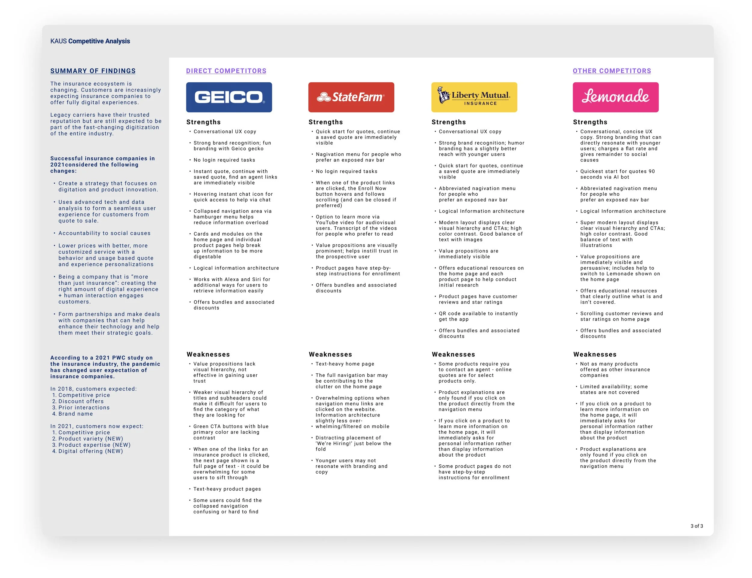
Competitive Analysis & Market Research
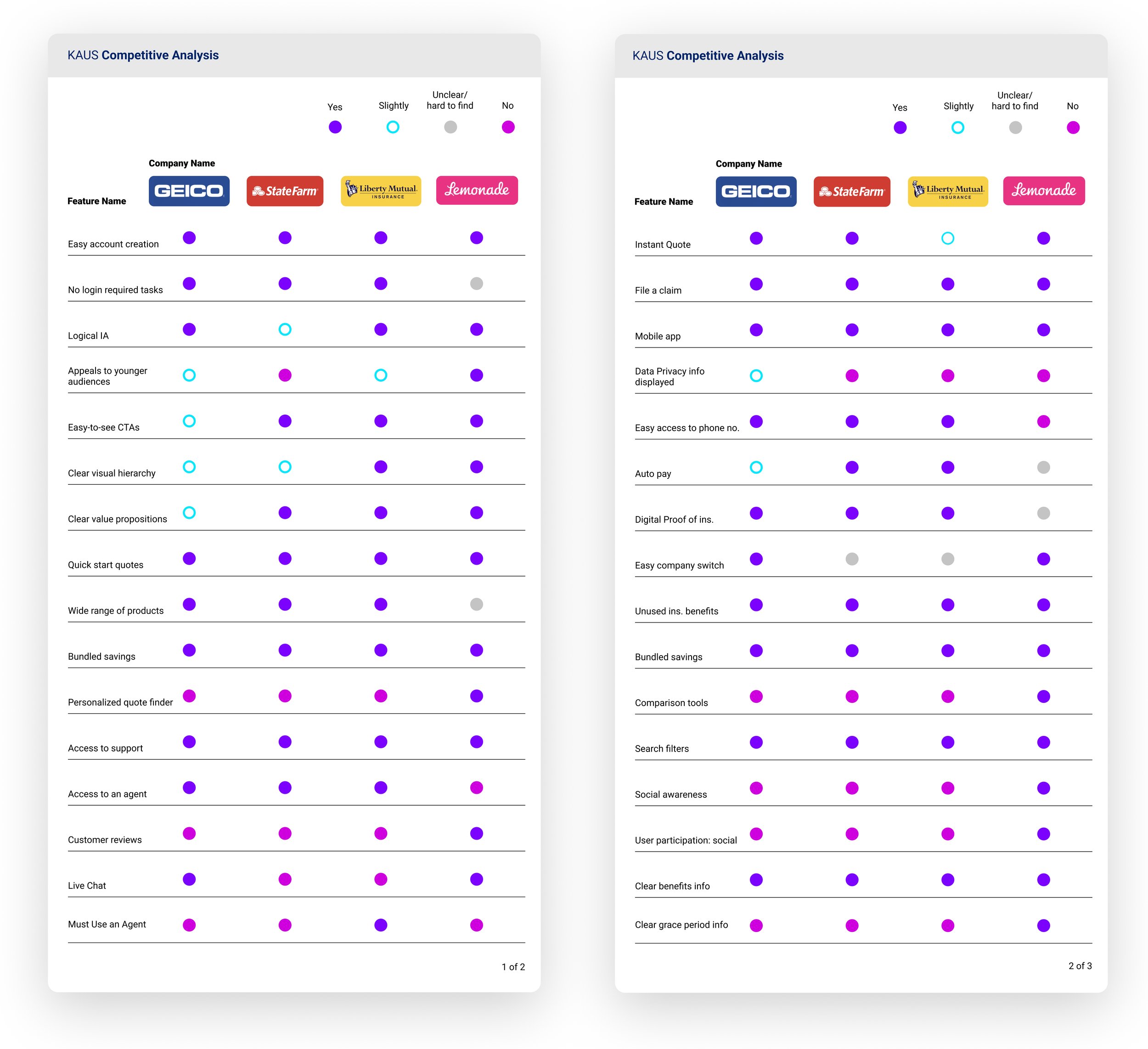
To get a general sense of the current Insurtech market, I chose some well-known companies that either had competitively-priced packages or appeared to cater to a younger audience.
I analyzed the companies’ weaknesses and strengths to understand what B2C features Kaus should have. I also noted opportunities Kaus could consider to better differentiate in the digital insurance/Insurtech space.
User patterns started to emerge from research findings, and I was able to quickly create provisional personas. The personas allowed me to narrow down on a primary persona as well as other types of users I needed to keep in mind during the next phases of the project.
Provisional Personas

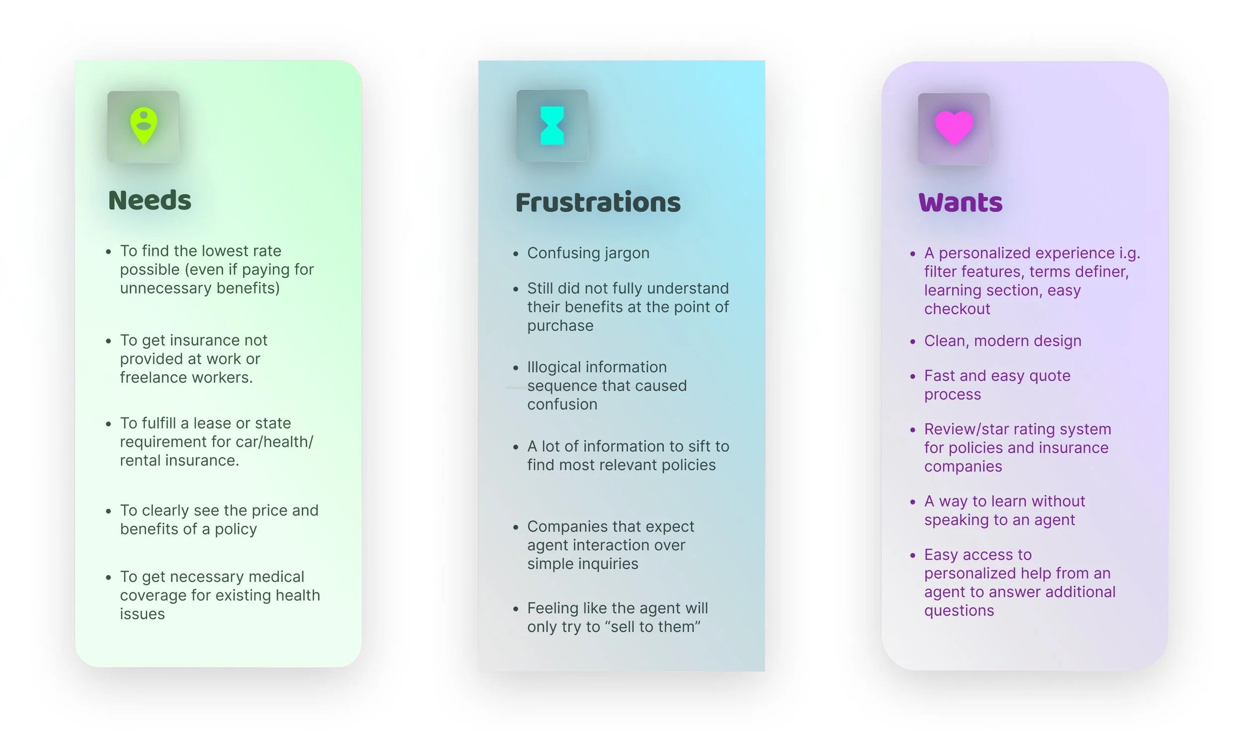
The next step was to conduct 1-on-1 user interviews to gather qualitative data about user experiences with online insurance shopping. I learned about users’ needs, frustrations, and wants:
Research Findings
⚡️Challenge

🎯 At this stage, I chose Kaus’s Health Insurance product as my focus since user interviews clearly conveyed to me that it was the most frustrating type of insurance to shop for.
Define Components
User Persona
Site Map
User flows & task flows
Wireframes
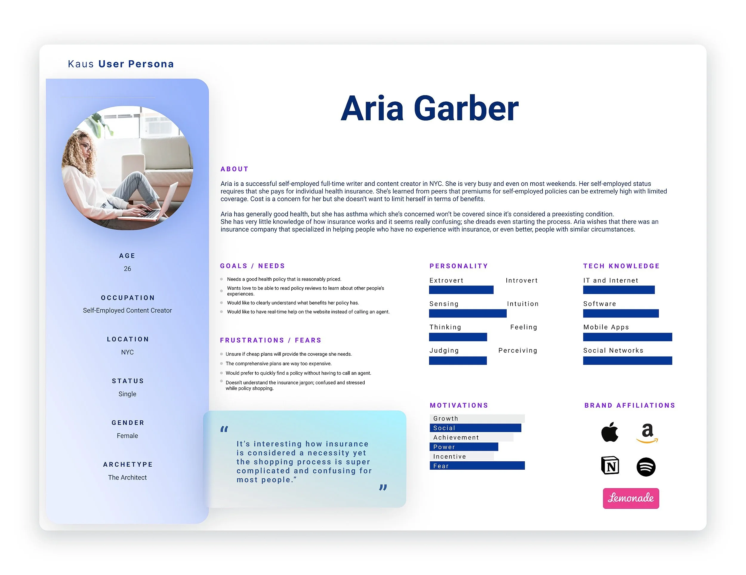
User Persona
I developed a user persona, Aria G., based on a trend I saw emerging during interviews: the majority of people shopping online for health insurance are either unemployed or freelance workers because employed users often receive health insurance through their employers.
It’s also likely to be their first time shopping for health insurance. My persona took these observations into consideration.
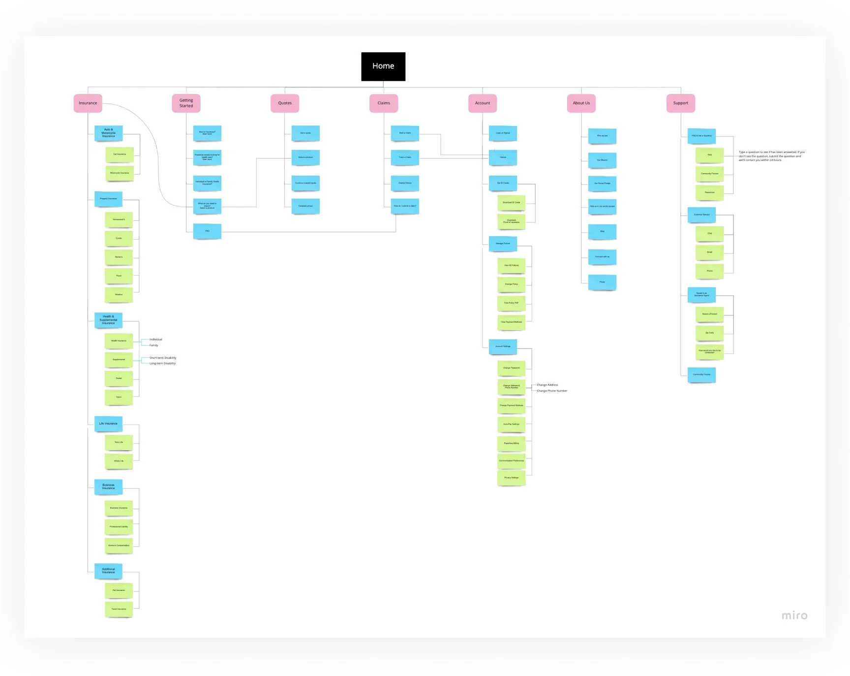
Site Map
Based on card sorting results, the site map of Kaus’s entire Information Architecture was designed to be as simple and linear as possible to help avoid user frustration when trying to find a category. Some sub-categories are also placed in additional main categories for ease of access i.g. Support.
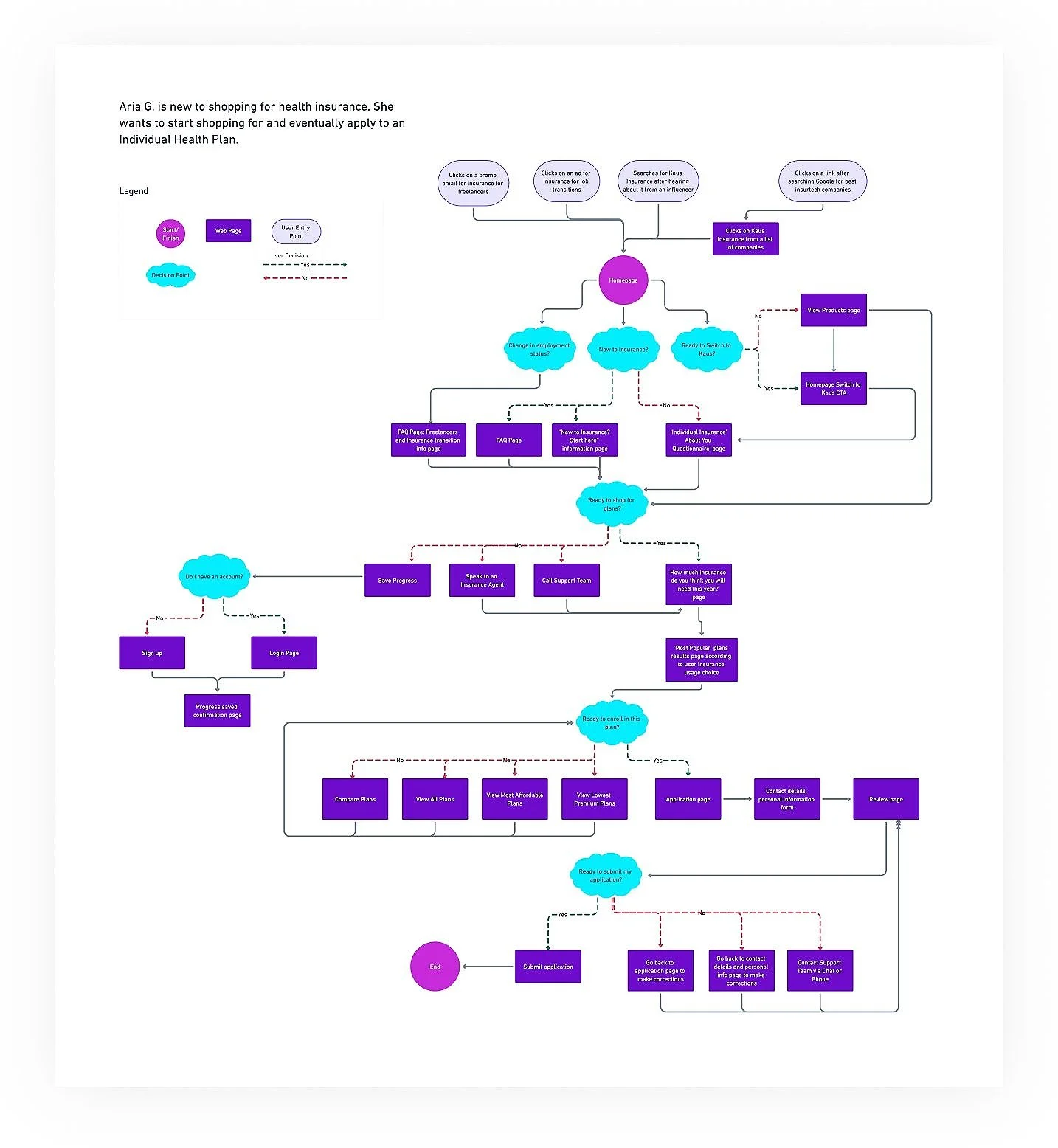
User Flows & Task Flows
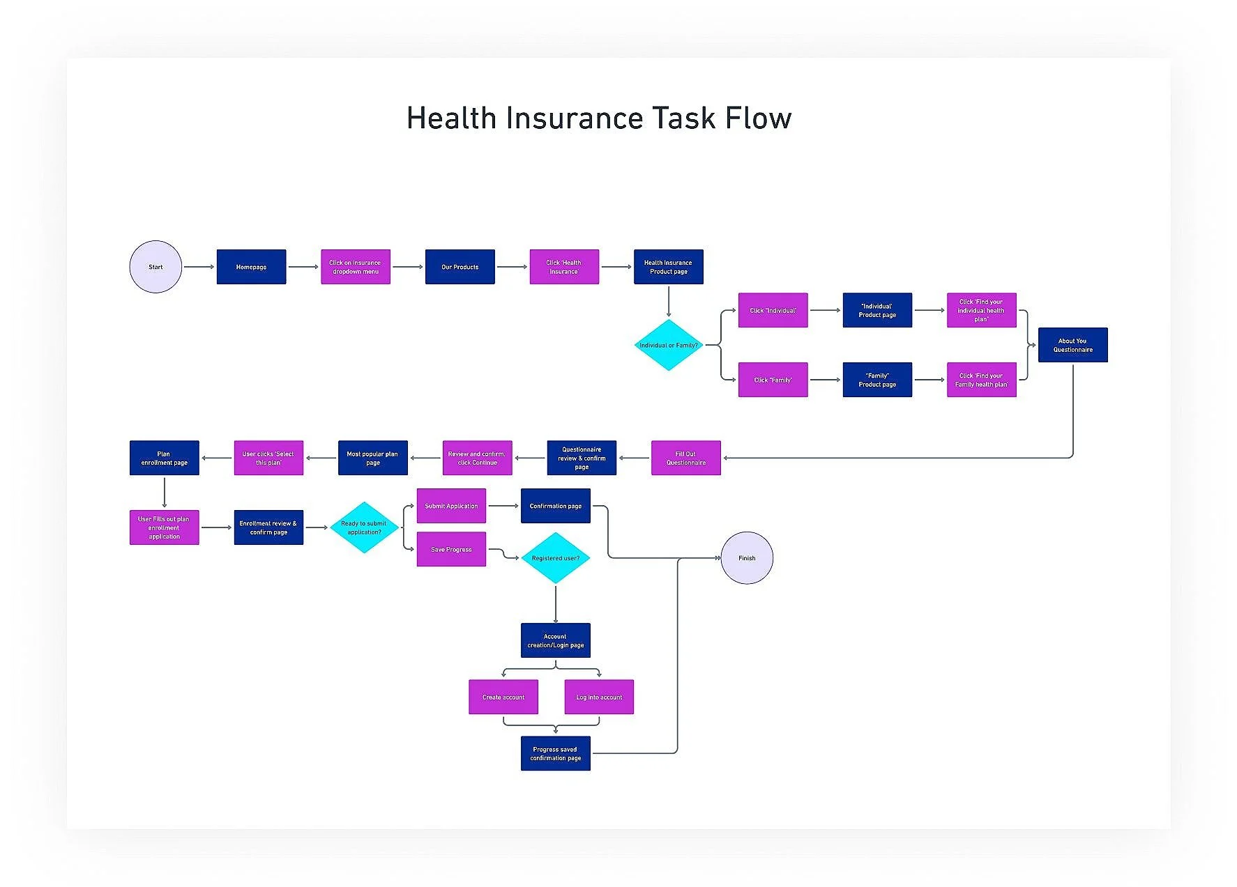
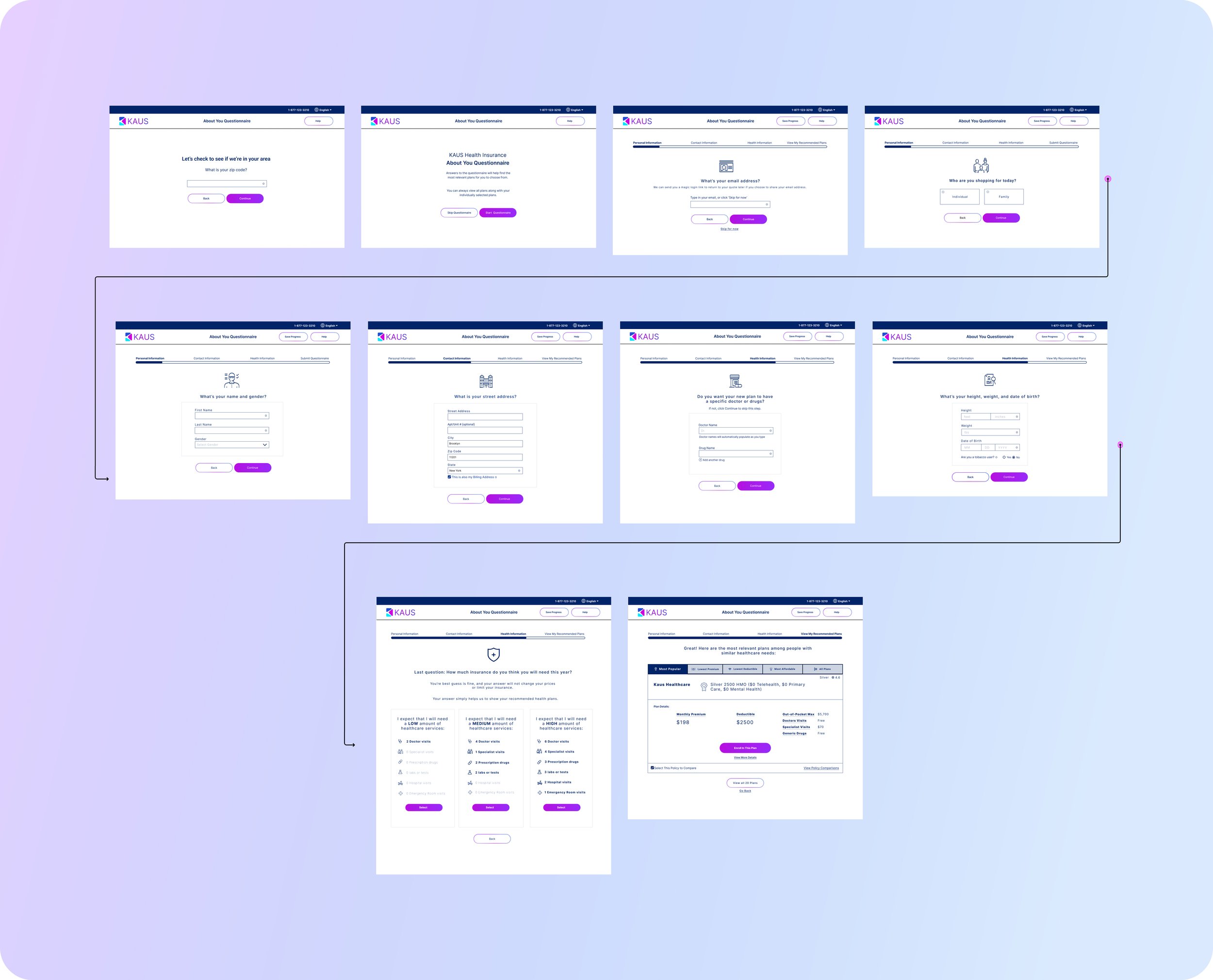
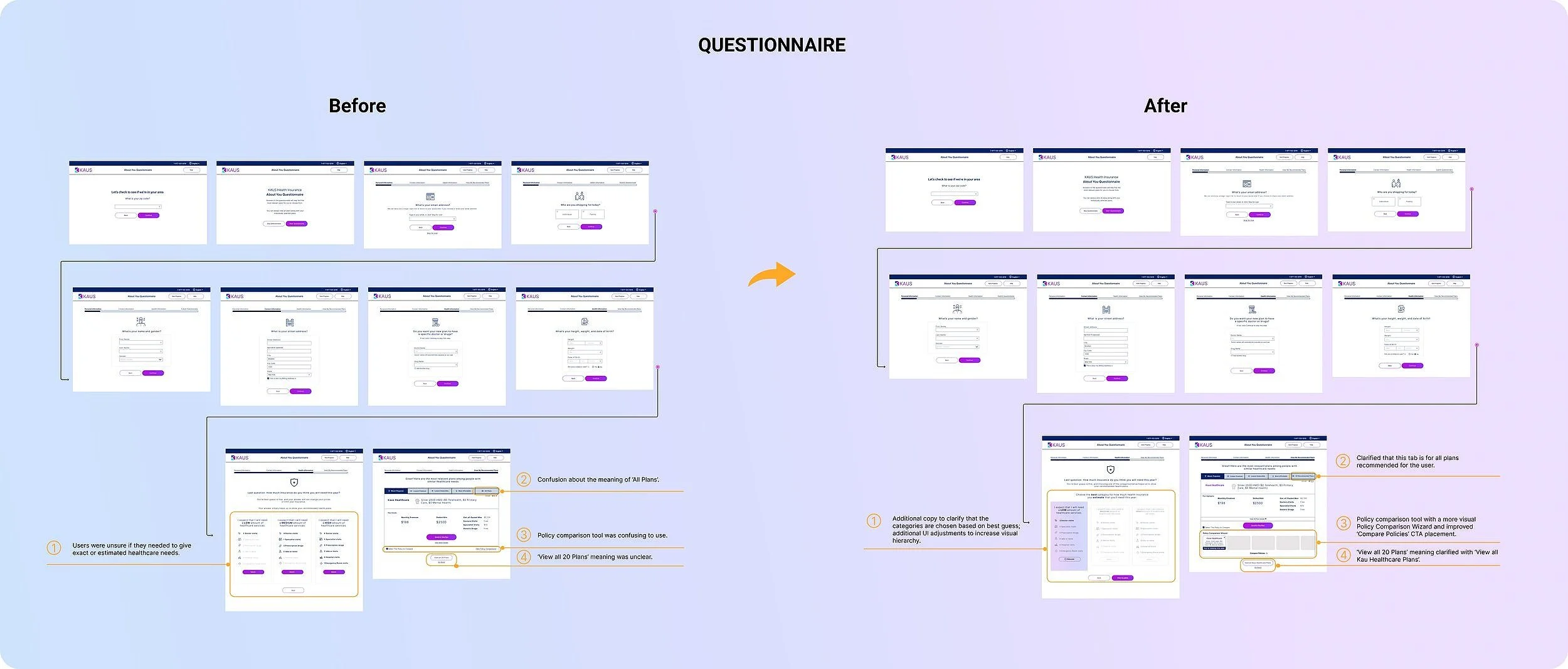
I created a health insurance task flow for filling out the About You Questionnaire. Although I’d be giving users the option to skip the Questionnaire, I presumed from user interview feedback that most users will choose to complete the Questionnaire.
The user flow empathizes with my user persona to map out all possible entry points, scenarios, options, dependencies, and outcomes for new, inexperienced health insurance shoppers.
Wireframes & Low-fidelity Prototype
I created wireframes and a lo-fi prototype from several initial sketches. The lo-fi prototype test feedback showed me where to make changes in the Design phase.
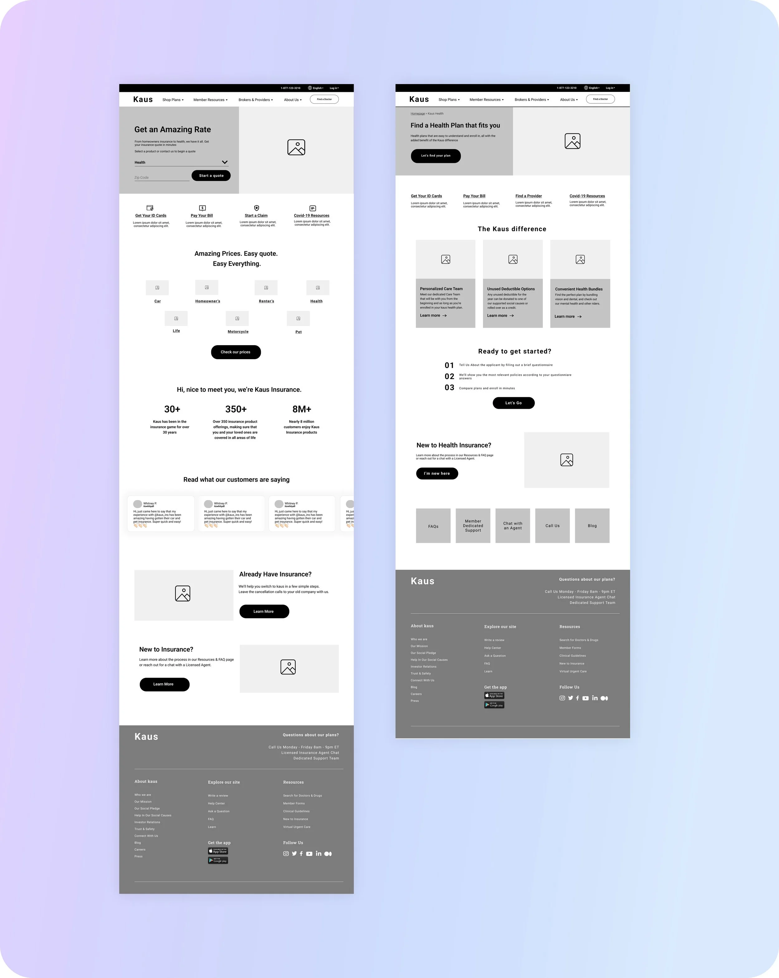

🎯 Since much of the user feedback interviews conveyed that users are drawn to a modern UI rather than a traditional one, my goal for Kaus was to design a modern and unique brand and UI.
Design Components
Kaus Logo & Color Palette
UI Kit
High-fidelity Designs & Clickable Prototype

Kaus Logo & Color Palette
The logo uses triangular shapes with a 10px corner radius to abstractly form the letter ‘K’ from the negative white space.
The softened corners are meant to convey approachability while the Kaus wordmark, in a simple uppercase sans serif font, is meant to exude strength.
The Kaus color palette displays vibrant colors to highlight agility and modernity, yet brings a sense of solidity from the dark blue. The white is slightly warmer to reduce eye strain.
Brand messages: modern, approachable, memorable, vibrant, professional, trustworthy
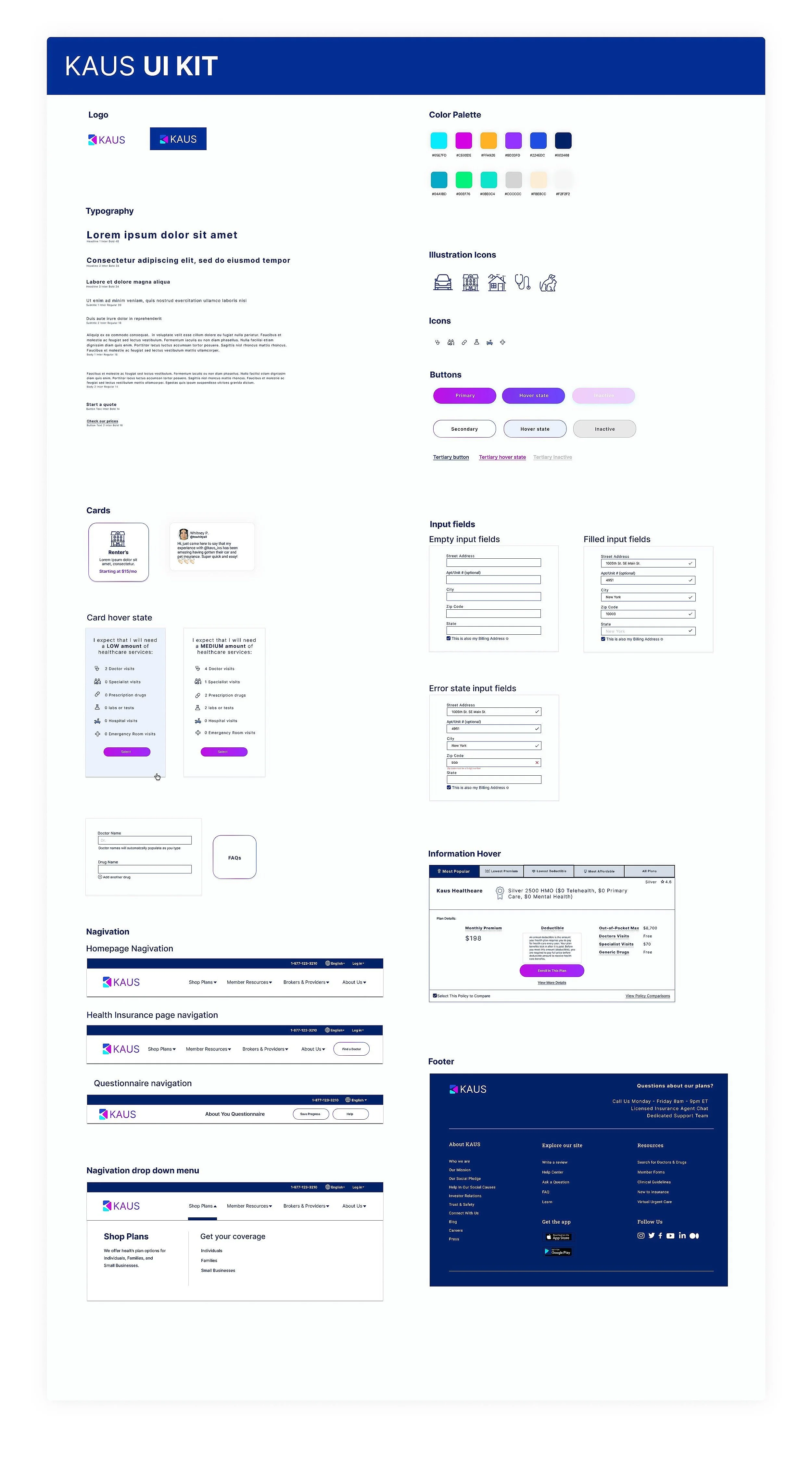
Kaus UI Kit
I chose Inter as the sole typography to maintain the clean and modern feel.
The color palette was supplemented with additional hues that I planned on working with to make the illustrations.
I decided on outline icon illustrations for a sense of lightness to balance the dark blue used throughout.
Gradient buttons and outlines increase the playful and approachable brand image.
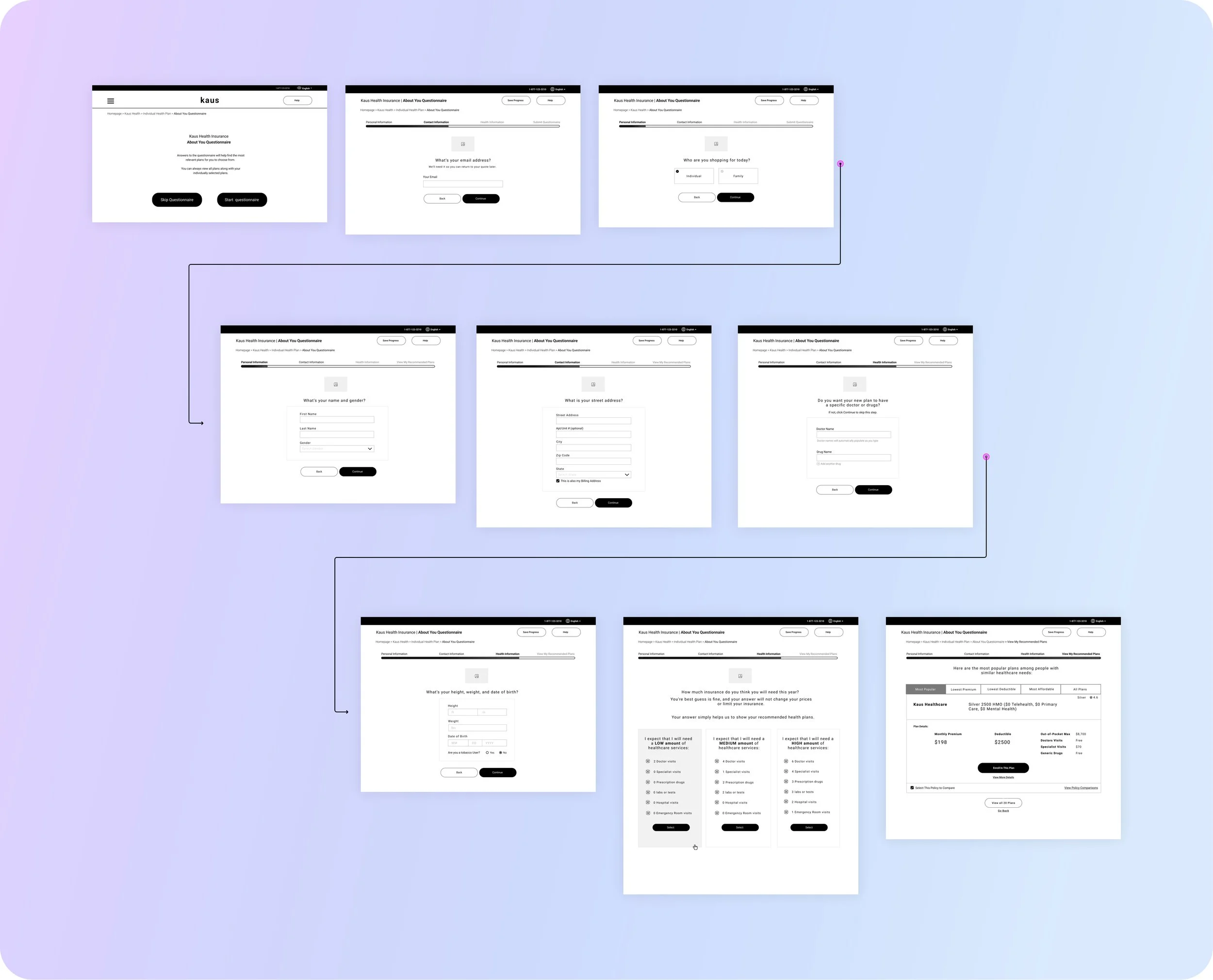
Hi-fi Designs & Prototype
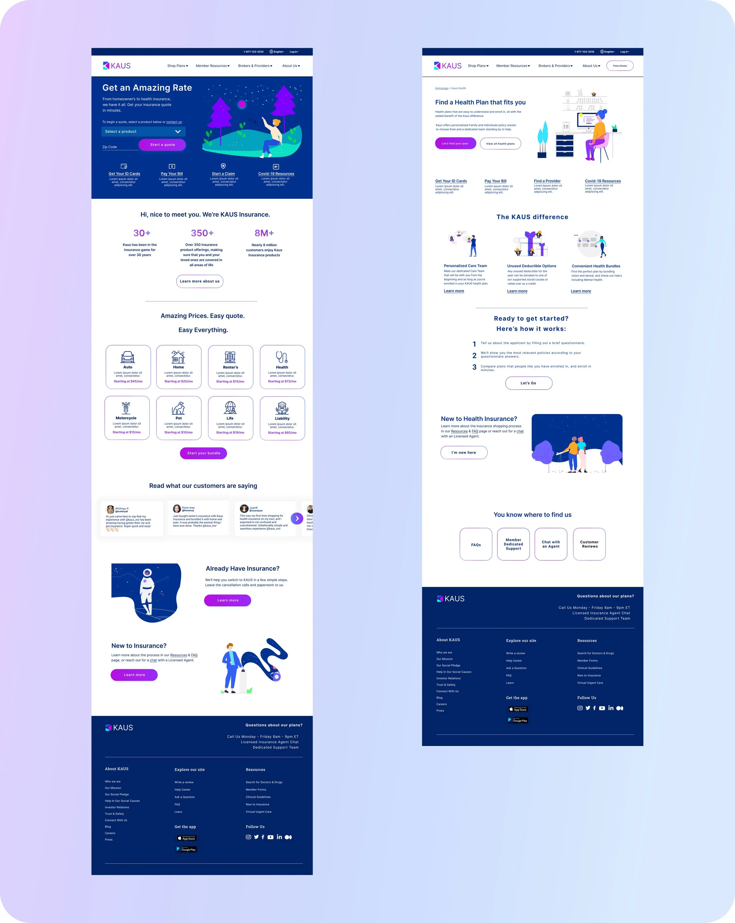

🎯 To test the high-fidelity designs, I created a clickable prototype in Figma and tested 6 participants on three tasks.
Design Components
Kaus Homepage, Health insurance product page, and questionnaire clickable Prototype in Figma
Task 1: User exploration of the KAUS homepage
TASK SCENARIO:
“Imagine that you need to shop for a new health policy, and you found KAUS in a Google search. You aren’t familiar with KAUS, and you’re interested to learn more. You clicked on the search result link, and it took you to this homepage. I’ll give you a moment to get your first impressions.”
TASK NOTES:
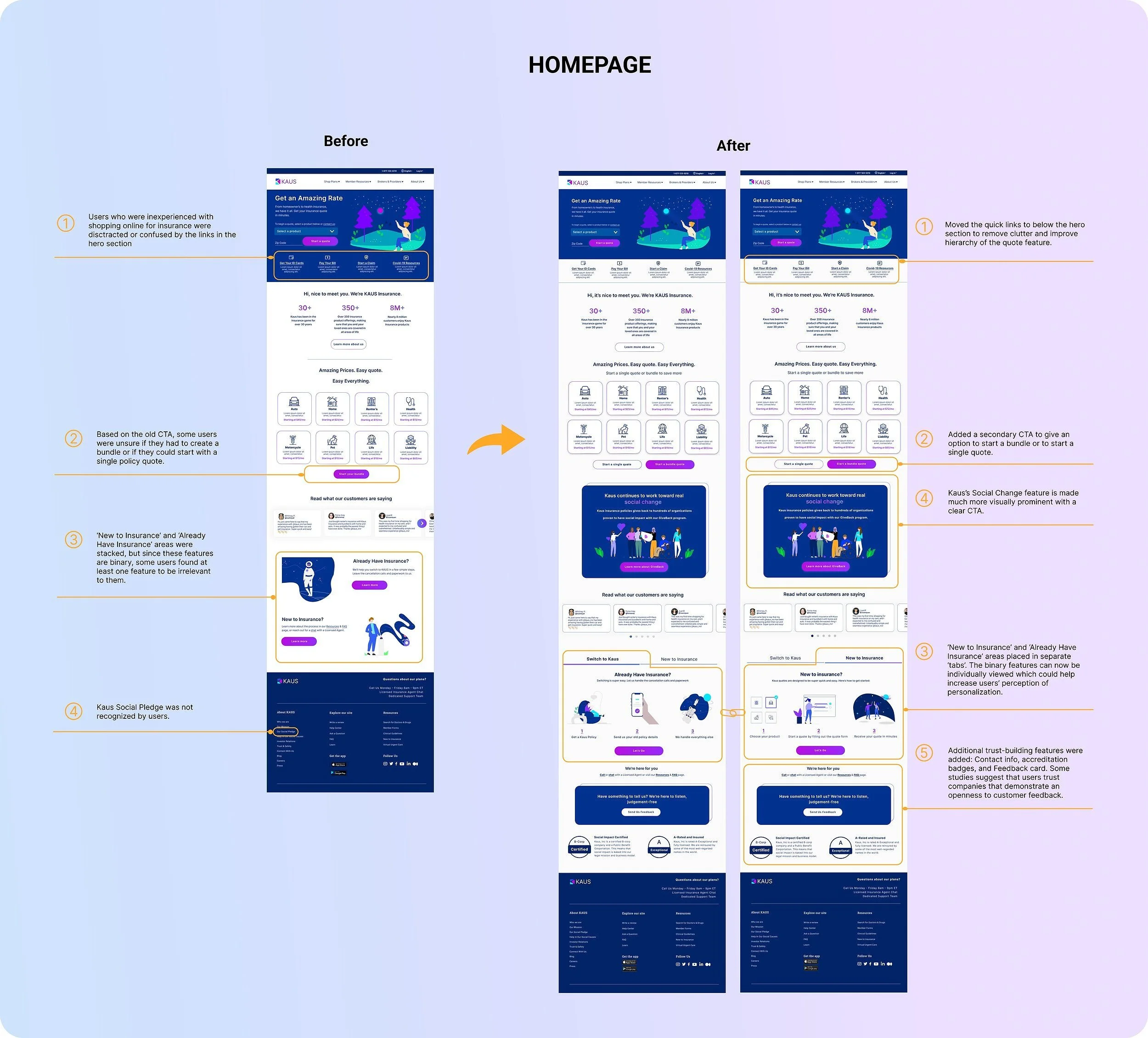
Participants liked the UI and got the impression that the company was modern. Some participants found the hero section overwhelming i.g. the moon and CTA buttons are the same color. The lack of institutional accreditation lowered Kaus’s trustworthiness.

Task 2: Begin quote process
TASK SCENARIO:
“You’ve decided to go with KAUS for your new health insurance policy. You now want to get an idea of prices, so you’ll start the quote process. Again, I’ll give you a moment, and please talk through your thinking as you go.”
TASK NOTES:
Participants appreciated the questionnaire and that they were shown the most relevant policies for them based on healthcare needs. Two people questioned why they were asked for their address when they were already asked for their zip code. Most were unaware of Kaus’ social causes, which tells me that I need to increase the visual hierarchy in that section.
Task 3: View policies and select a policy
TASK SCENARIO:
“Now that you see the policies that are most relevant for you, you’re ready to look a few and then choose one.”
TASK NOTES:
Participants liked the way that the policy information was displayed, but several participants seemed confused about where to go to start the comparison process. Also, three users wanted to hover over some words to learn insurance definitions before starting to compare policies.

🎯 Armed with the results of the usability test, completing an Affinity Map, and charting the most valuable changes in a Value vs. Effort Matrix, I made some revisions to the high-fidelity designs.
Conclusion Components
Priority Iterations
Comparison Wizard feature add-on
What I learned
What I would do differently
I applied changes to the homepage, the health insurance product page, the questionnaire screens, and the policy results and comparison screens.
Priority Revisions

What I Learned
Younger audiences are often associated with inexperienced insurance shoppers who prefer to gather their own information if possible.
I empathized with the users who vocalized that they felt uncomfortable answering questions in the questionnaire about weight, age, or address. Although I wanted to remove those questions, I learned that business and regulatory requirements need to be satisfied along with the potential for increased bounce rates when users are asked unnecessarily personal questions.
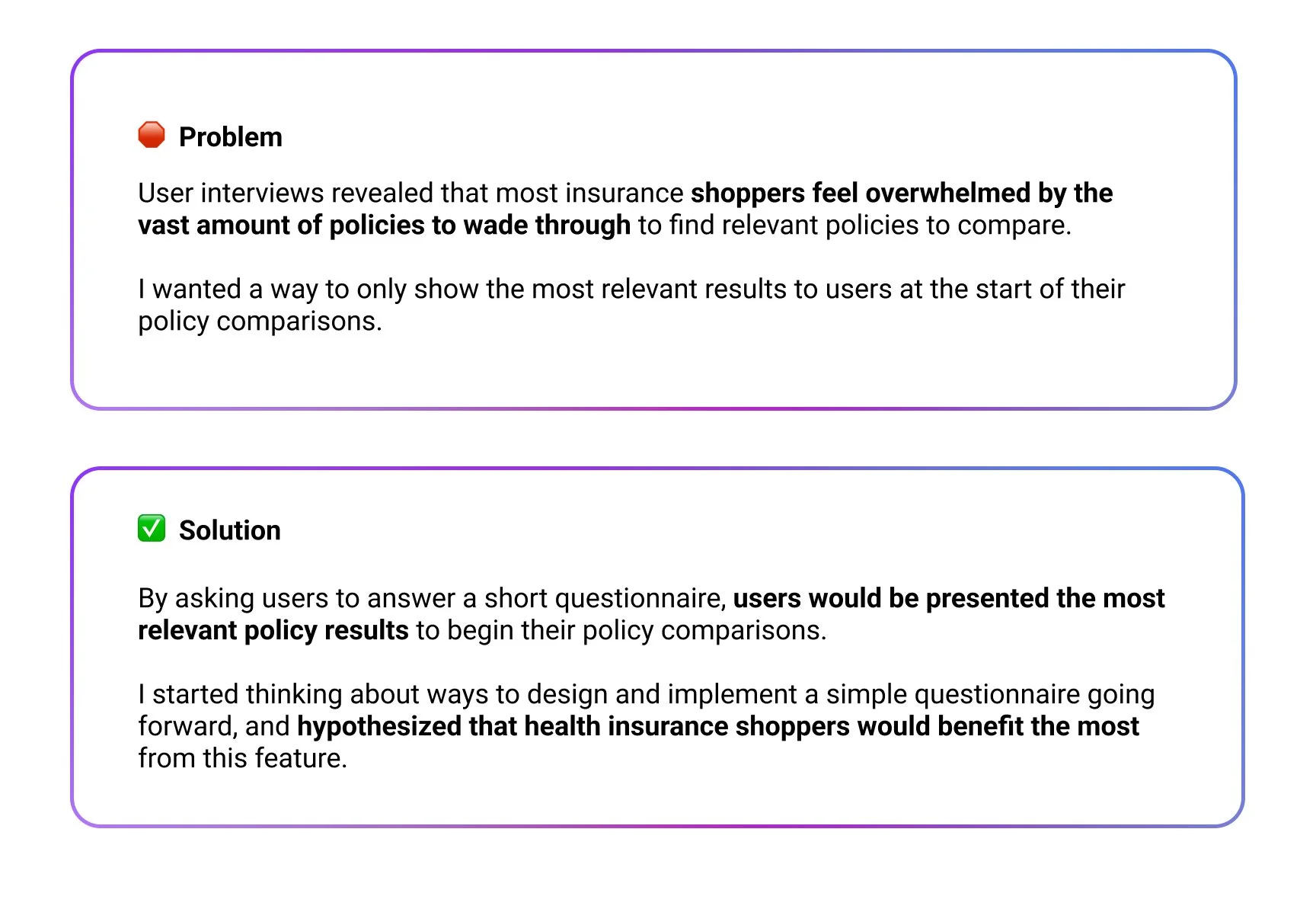
My hypothesis of filtering insurance policies for maximum relevancy was correct: most users showed appreciation for the questionnaire’s ability to reduce overload and only show the most relevant policies. However, the policy comparison feature is equally as important to help users become customers.
Conduct more user interviews to develop additional features to help inexperienced insurance shoppers
Research current requirements for insurance applicant information to possibly remove unnecessary questions from user questionnaire
Design policy selection, application, and enrollment screens
Design an FAQ screen that enabled users to directly type in their questions; if their answer is not displayed, users would be contacted.
Design a feature that helps users in real-time while they are choosing and enrolling in policies
If Given Additional Time, I would:
